Art Direction
Creative Direction
Evolving Without Losing Direction
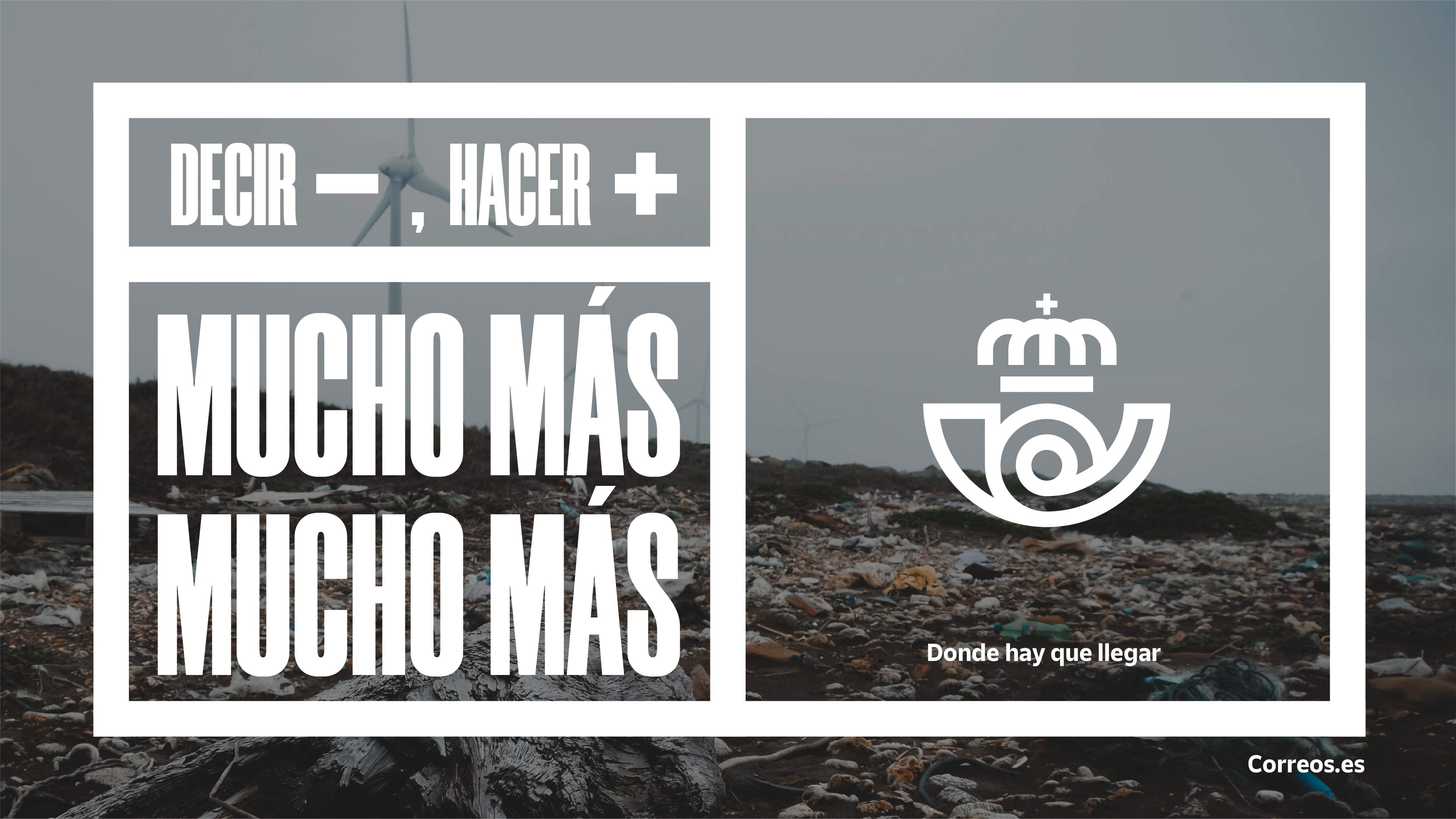
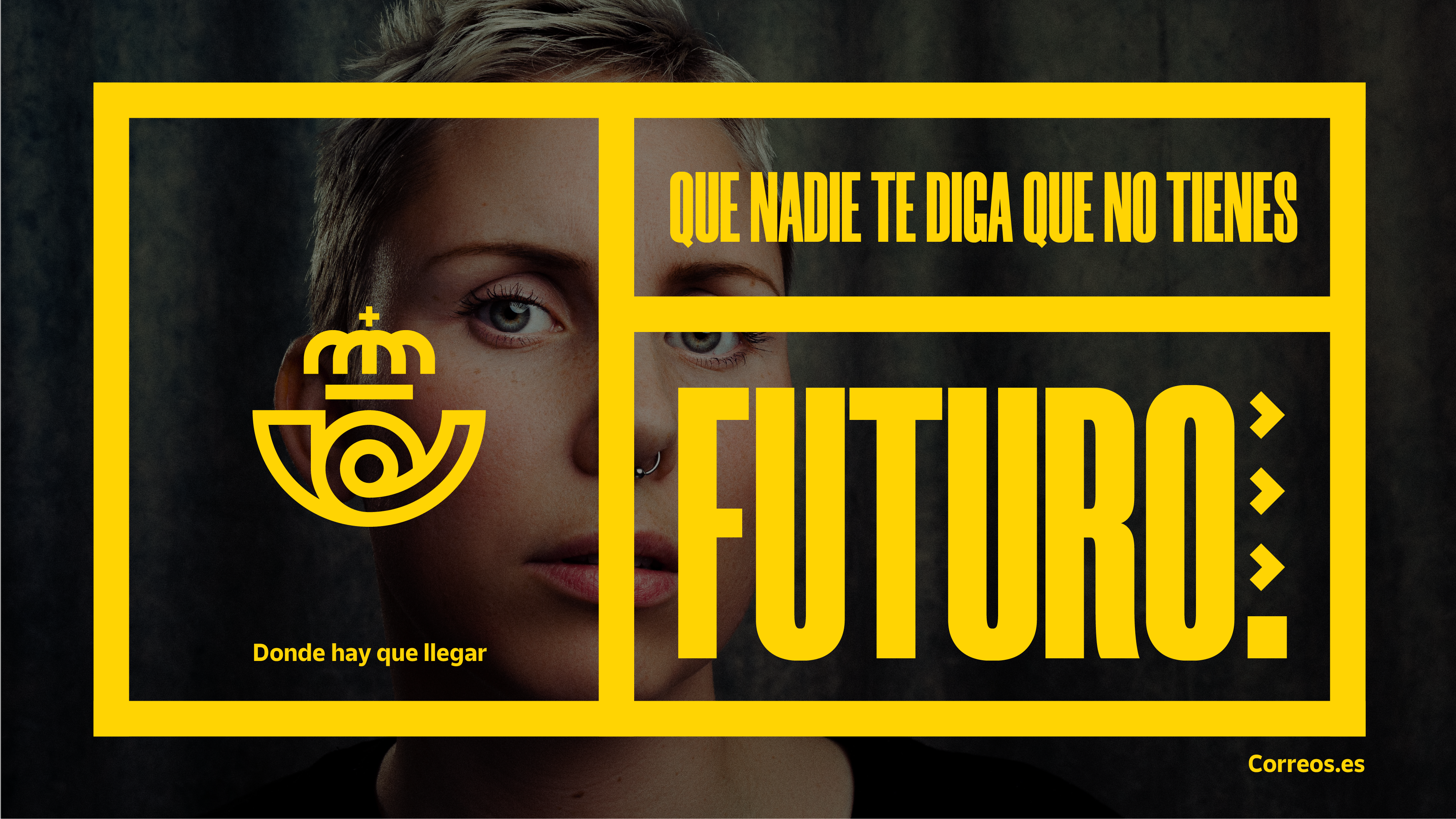
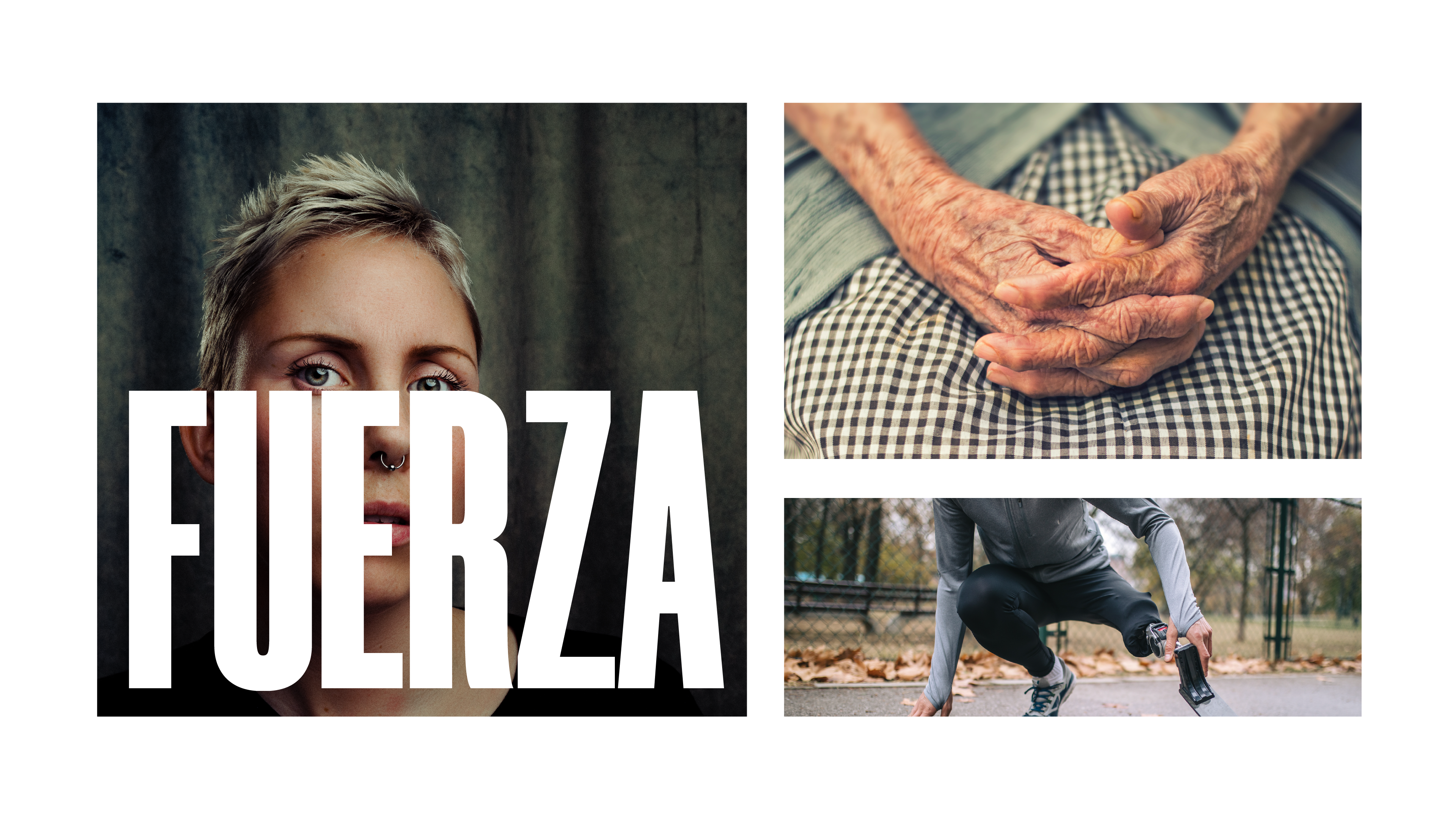
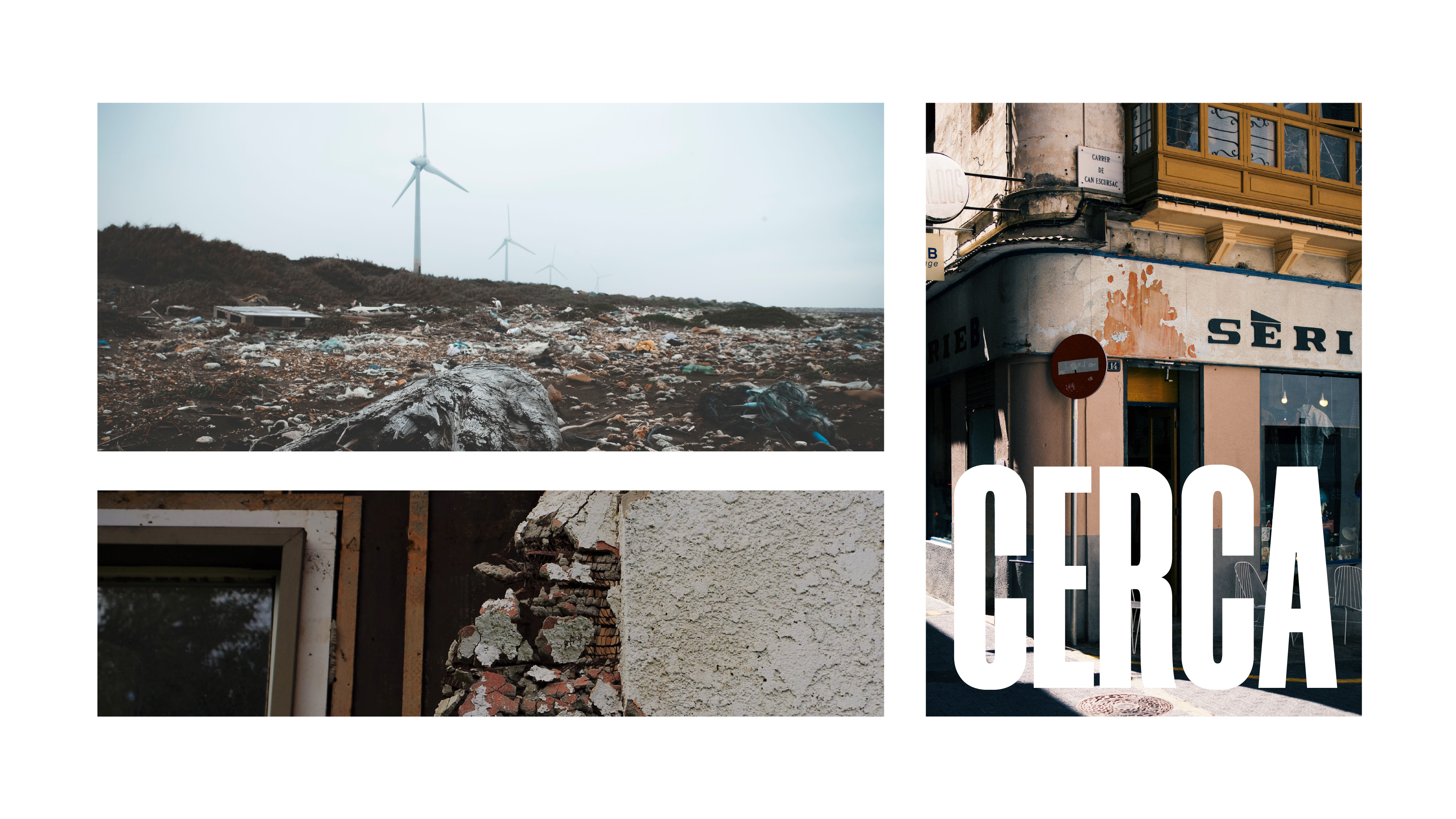
«Donde hay que llegar» – Where you need to go.
The redesign for Correos modernizes one of Spain’s oldest and most recognizable brands. Rather than a complete reinvention, the project proposes a typographic and compositional evolution that respects the iconic symbol while refreshing it within a more versatile and refined identity.
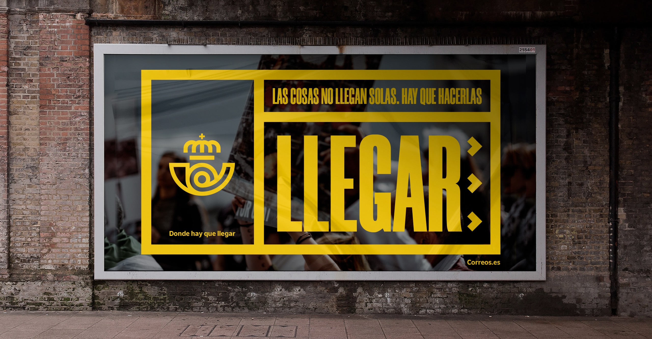
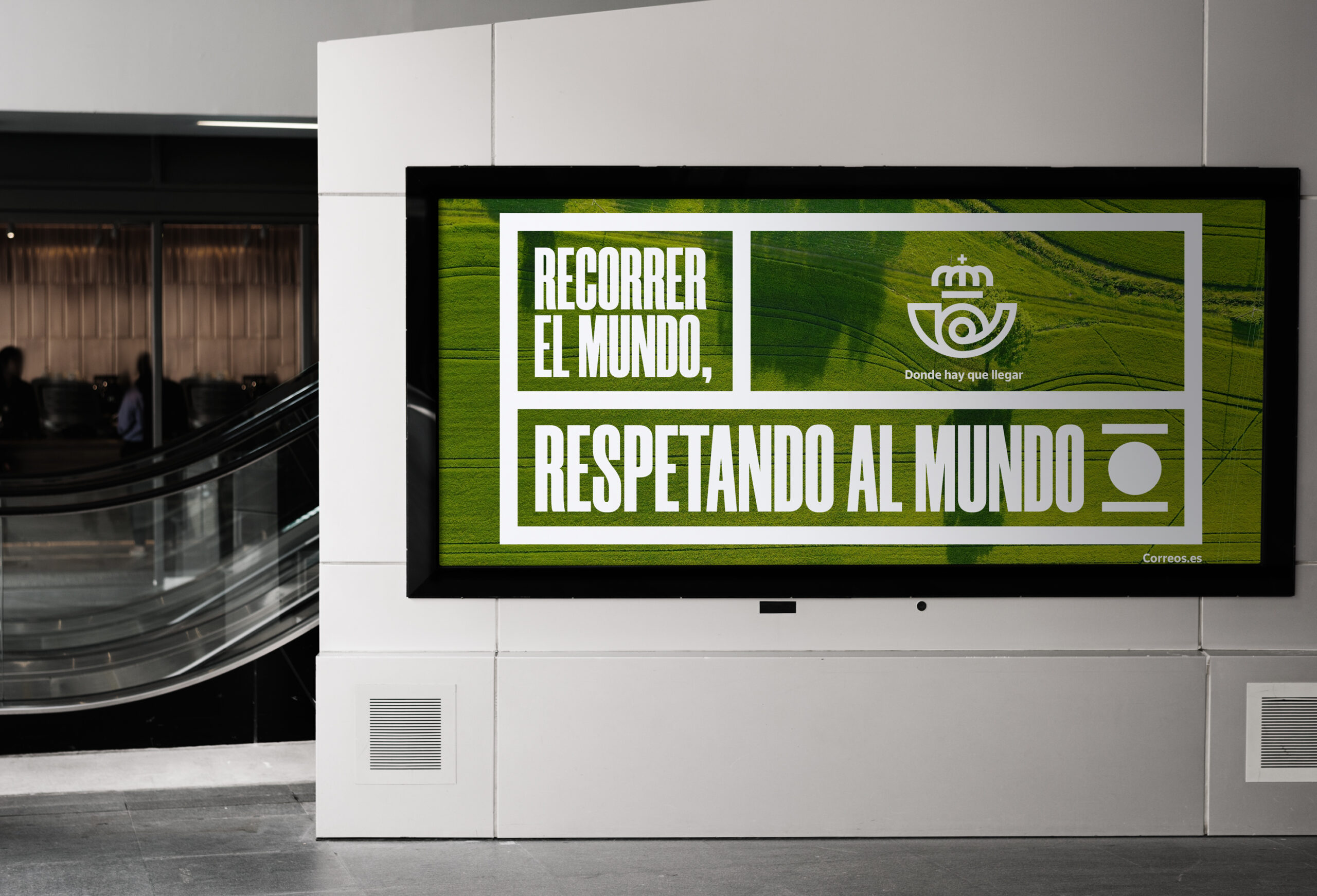
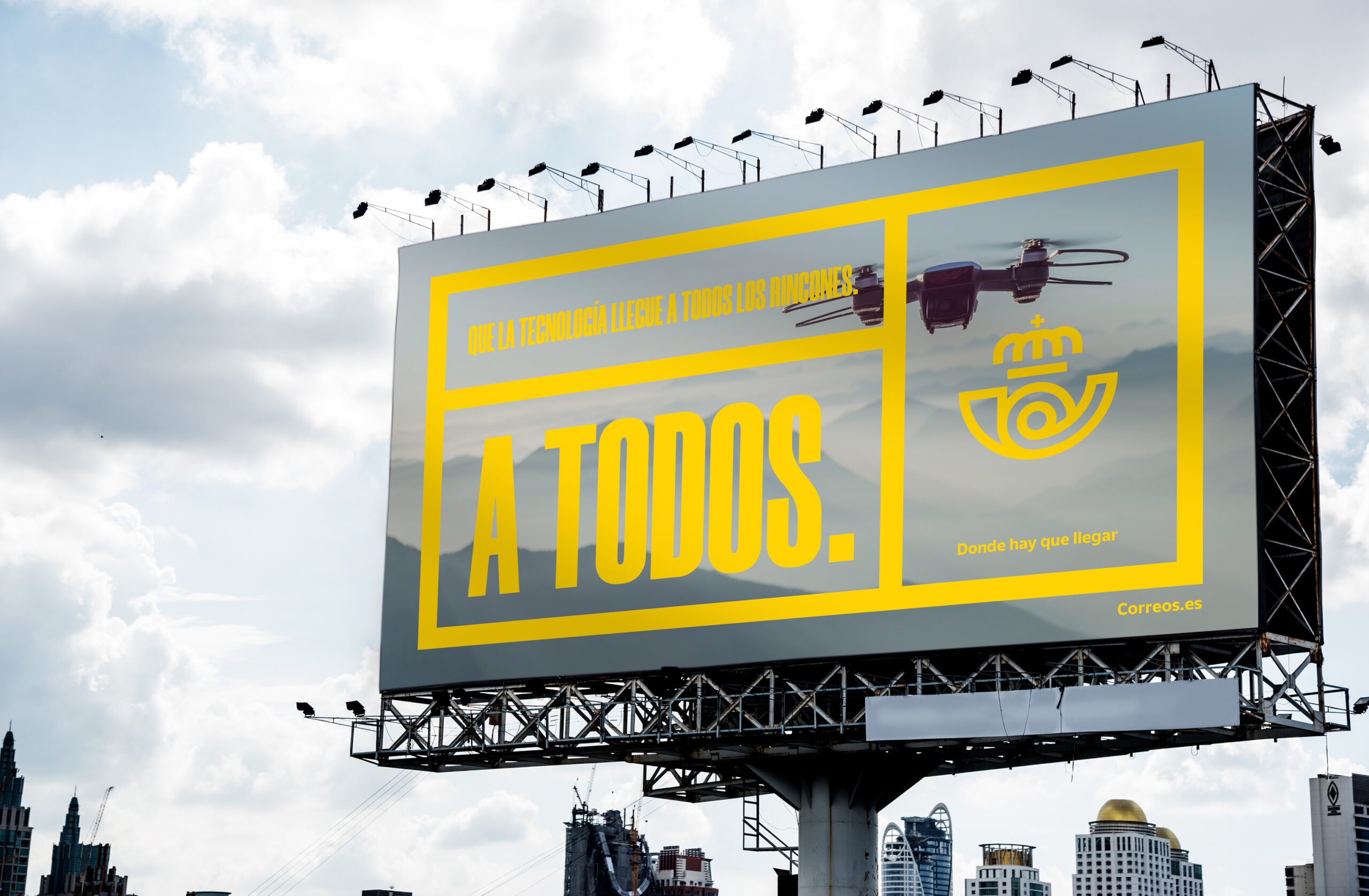
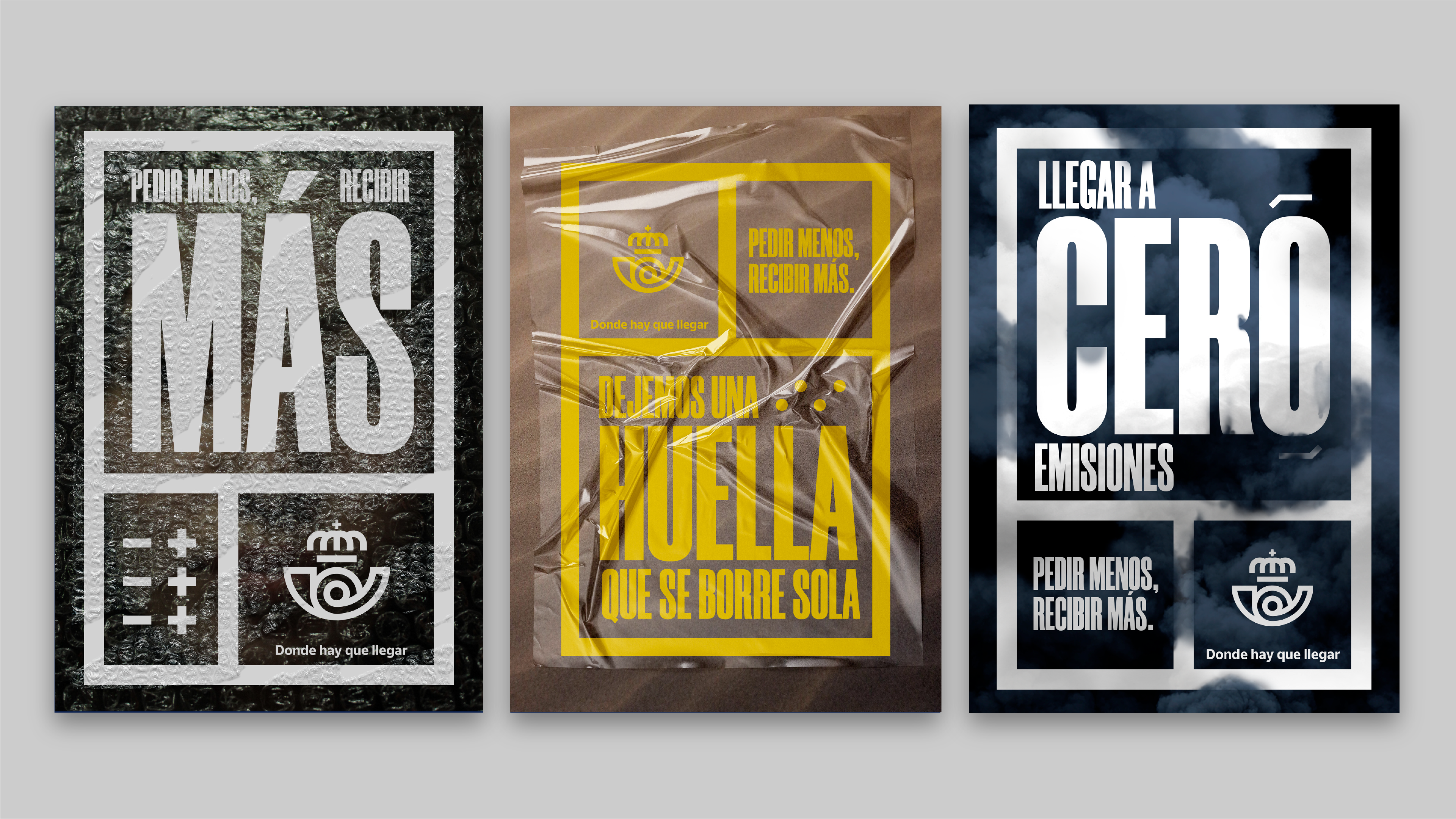
The color palette is preserved but recalibrated: the yellow shines brighter, the blue deepens, creating stronger contrast and legibility. Space usage, typographic hierarchy, and margin systems bring a new sense of clarity and reliability—without losing warmth.
The strength of this project lies in its system. Every element—from uniforms to mobile apps—has a place in a clear, coherent visual logic. Correos is no longer just a postal service: it becomes a public service brand for a country on the move.
This work is powerful because it shows that tradition can be redesigned without breaking, and that intelligent evolution means knowing what to change—and what to preserve.