CRUZCAMPO
Street Flavor, Design with an Accent
Art Direction
Visual design
The Challenge
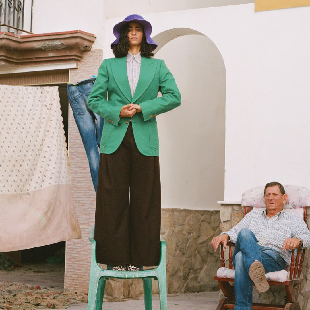
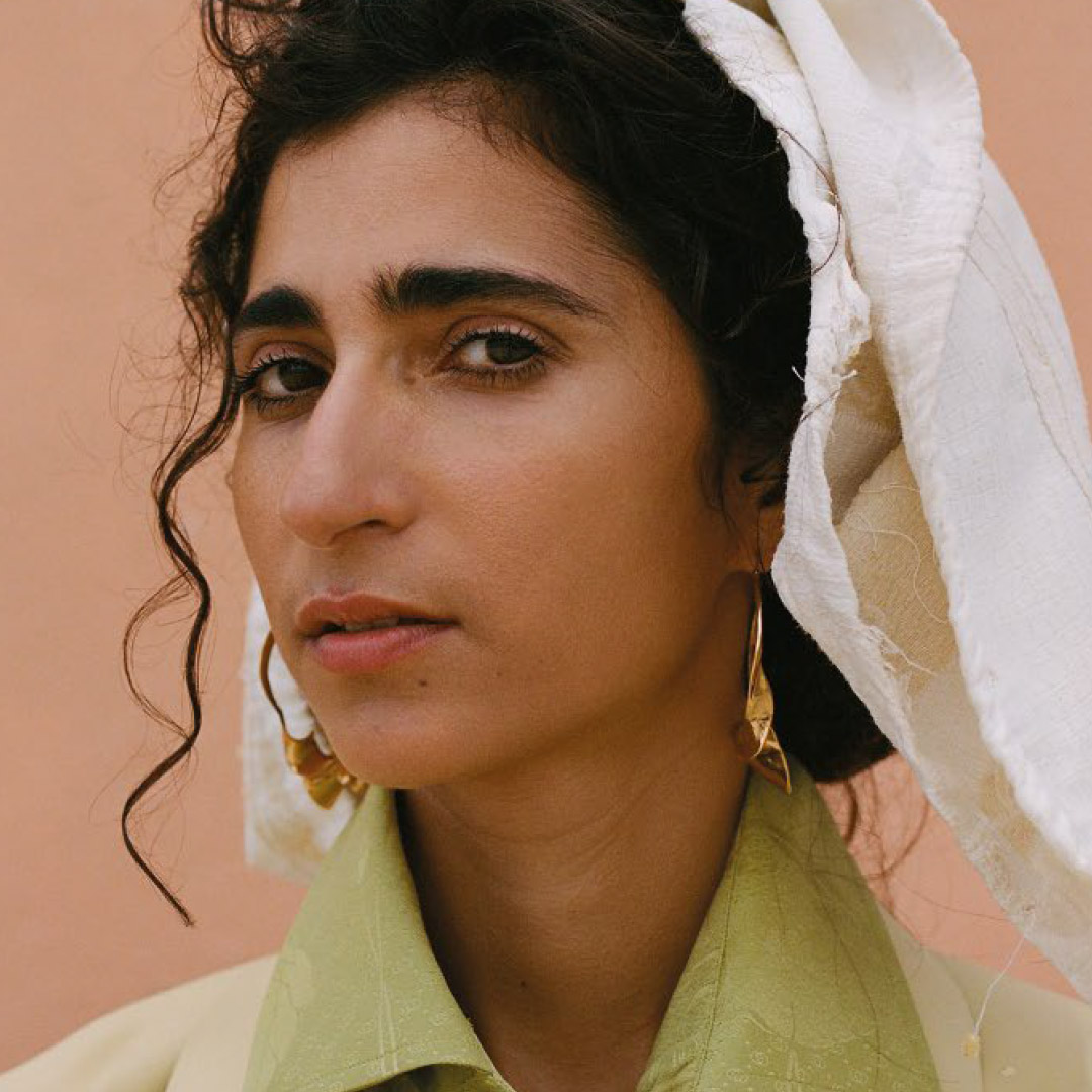
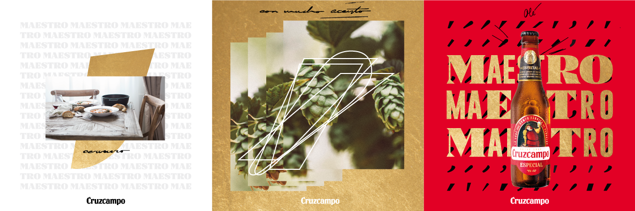
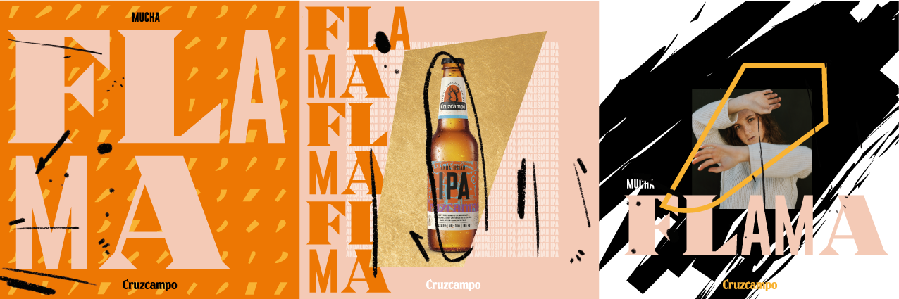
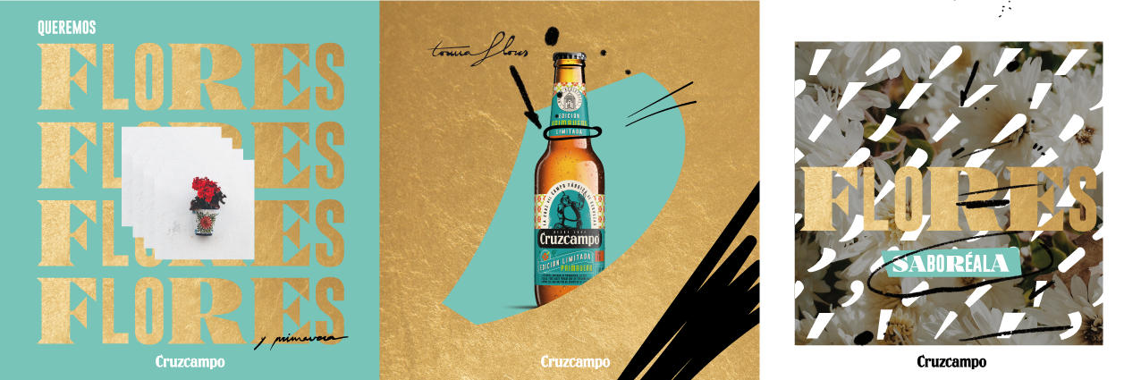
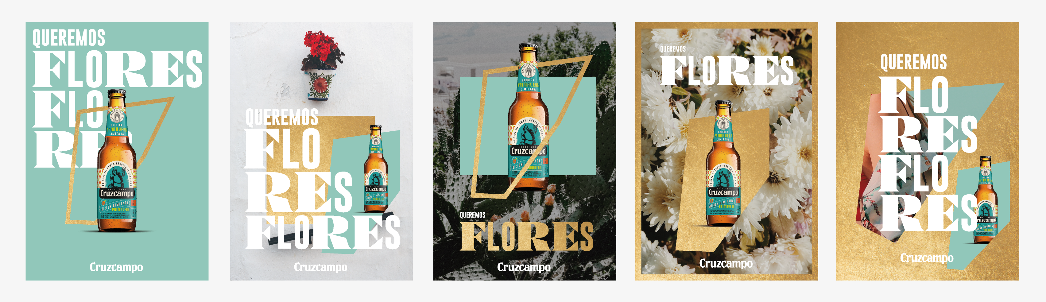
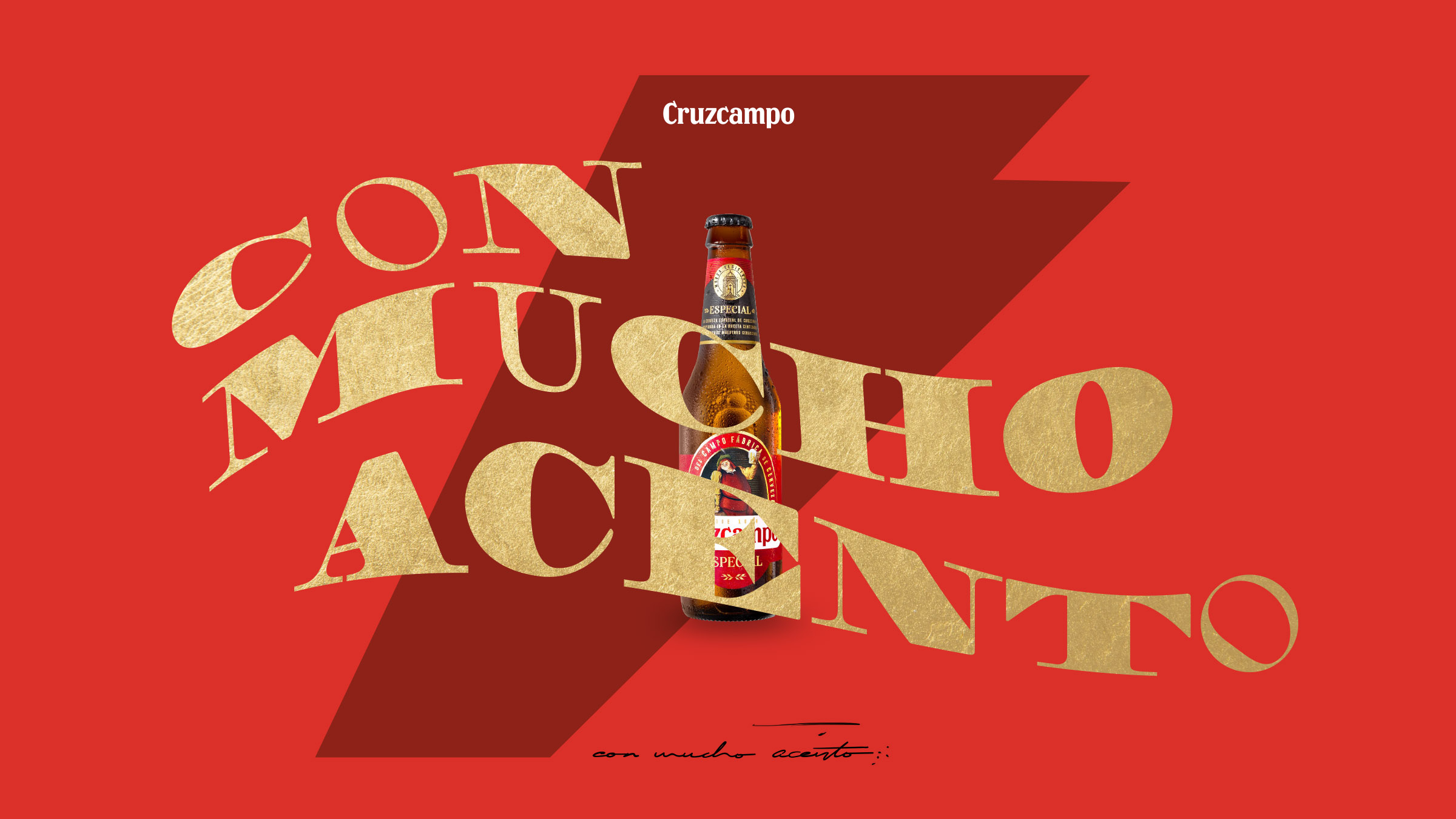
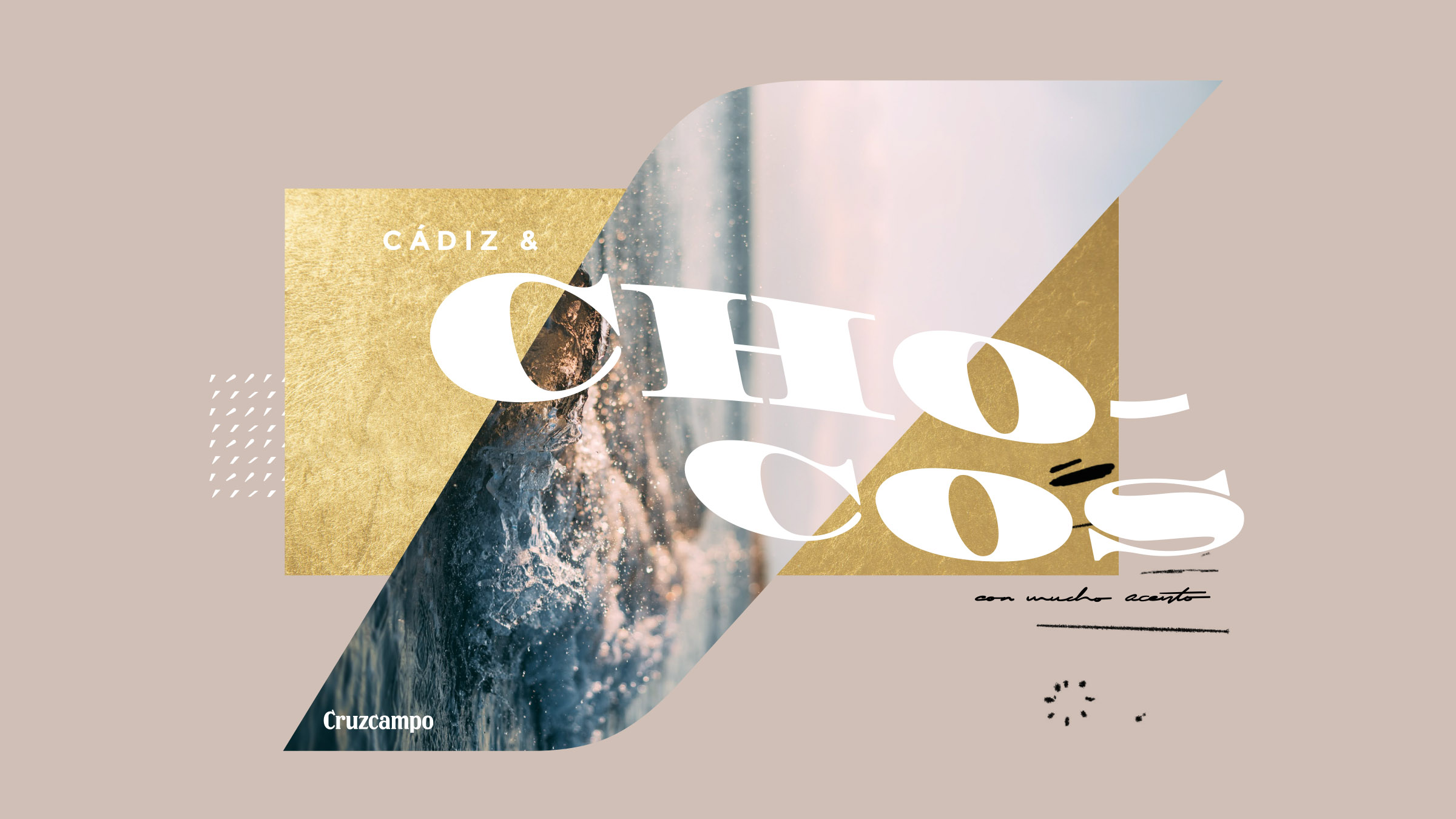
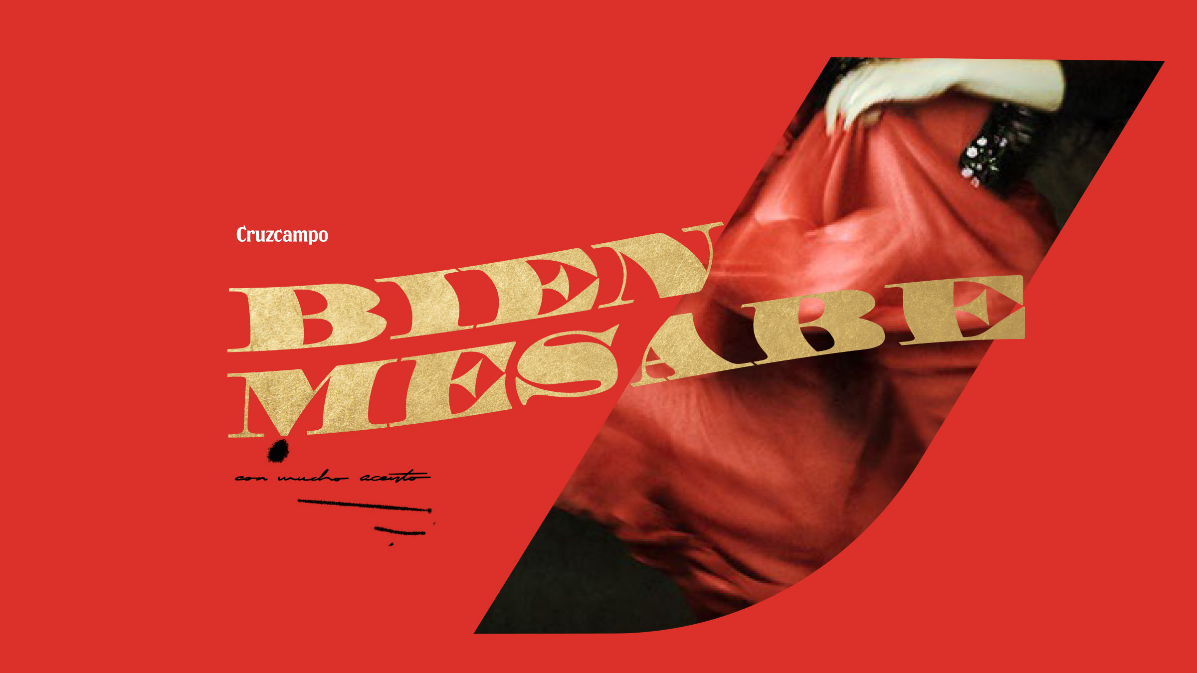
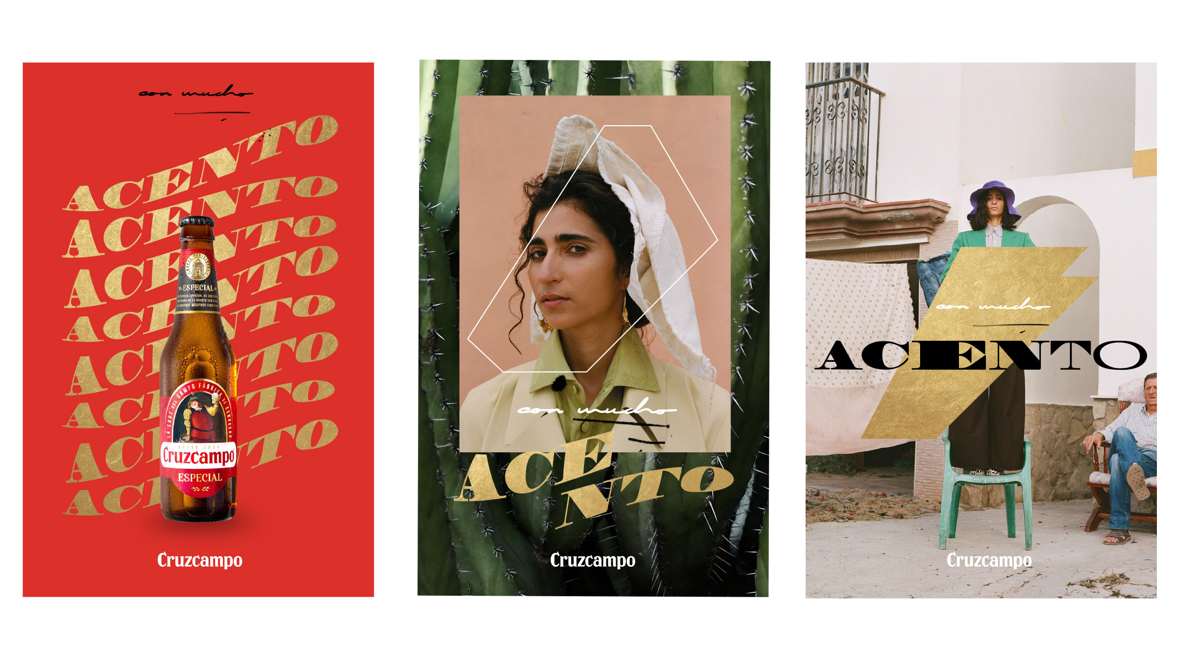
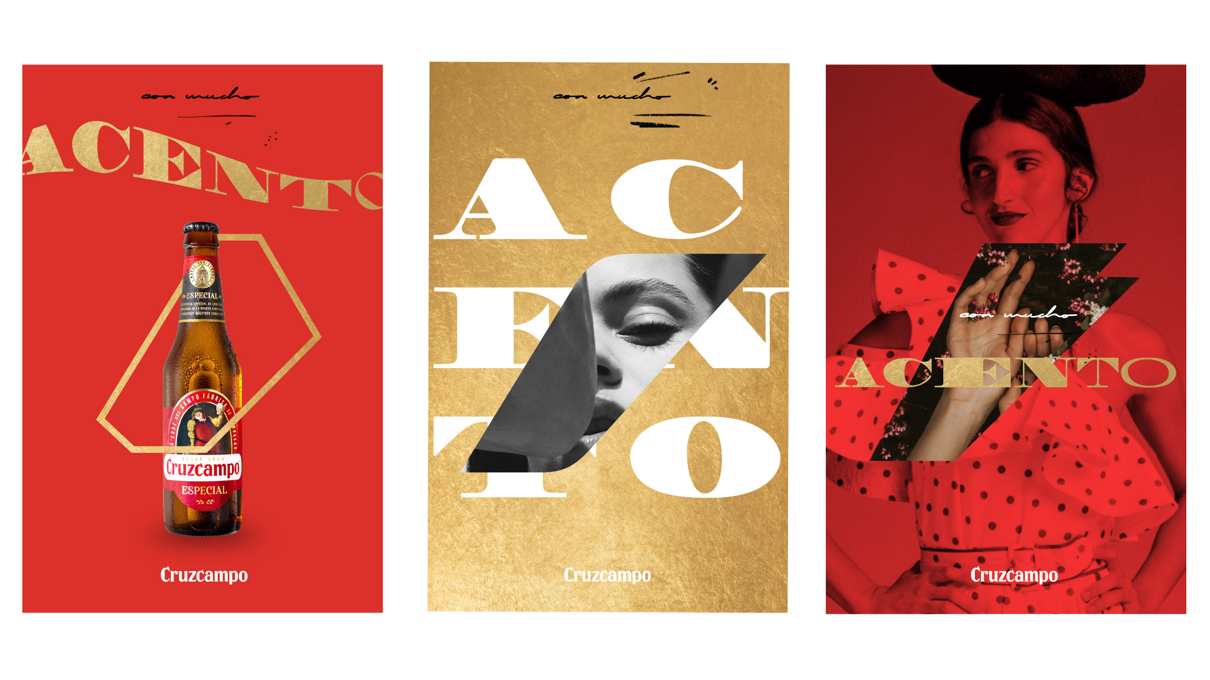
Refreshing Cruzcampo’s identity meant reconnecting the brand with its cultural roots, while giving it a visual code fit for the urban present. The design balances what’s popular with what’s contemporary—flavorful, but not folkloric.
The Approach
This work shines because it recovers Cruzcampo’s authenticity through current design codes. It’s a brand that speaks with an accent—and proudly so.
/ Inspiring with design
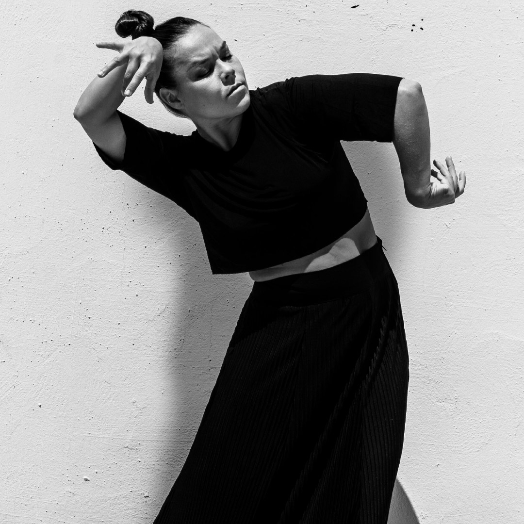
Typography is the beating heart: bold, clean, but with artisanal undertones. The layout speaks with rhythm, familiarity and intention. Nothing is ornamental—everything has weight.
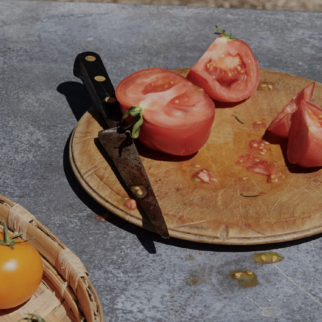
The color palette reinforces Andalusian identity without caricature. Red, white and black interact with wood, tile and paper textures. It’s a visual nod to the bar, to street life, to warmth.