OVERVIEW
ART DIRECTION
DESIGN
Institutional, but Always in Motion
Rebranding an institution like the Higher Sports Council of Spain represents a unique opportunity. The oportunity to breathe new life into traditional organizations. That’s why this proposal focused on a strong and disruptive identity, which ultimately led to the creation of what it is today—a more contemporary and globally open brand.
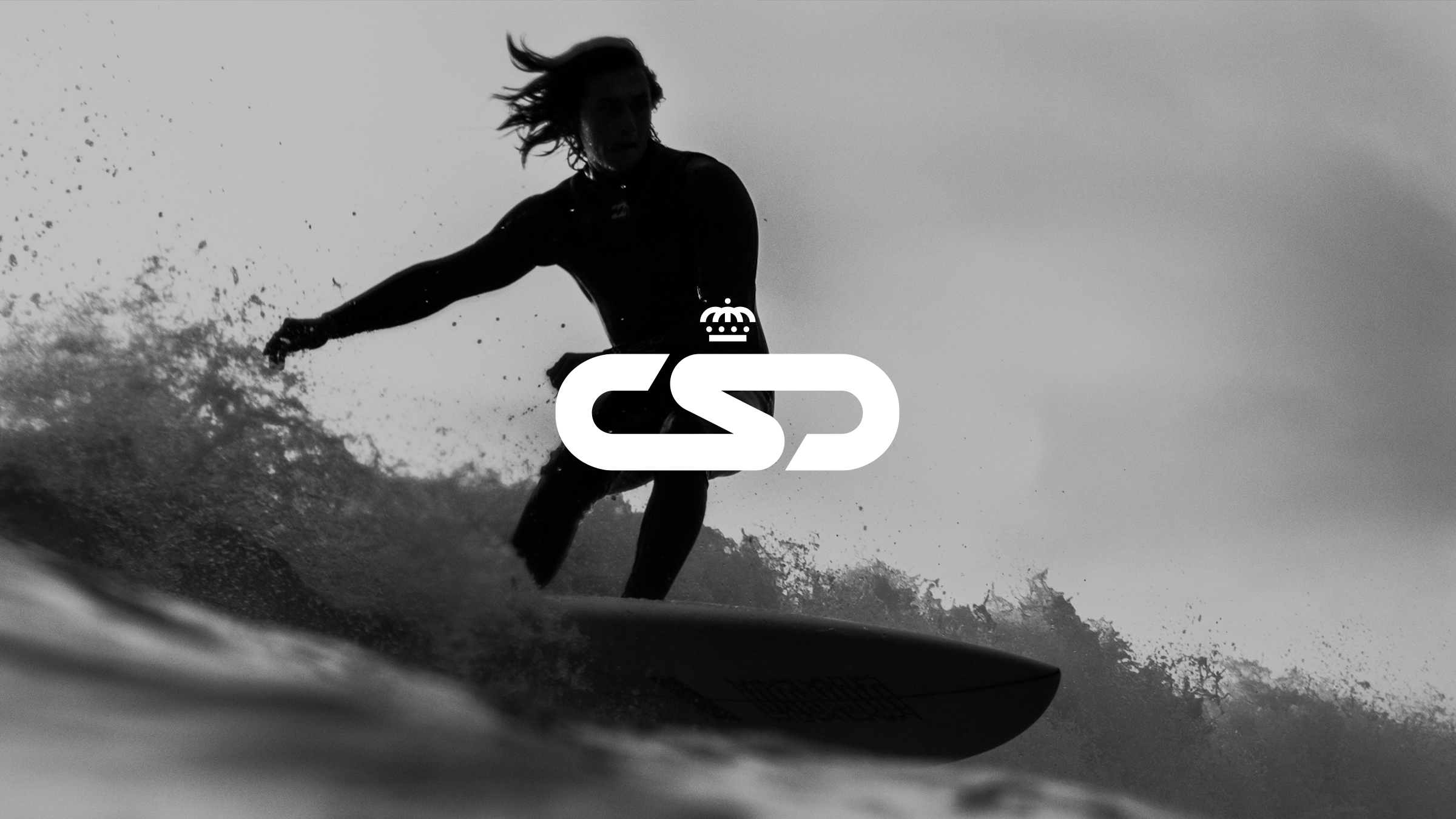
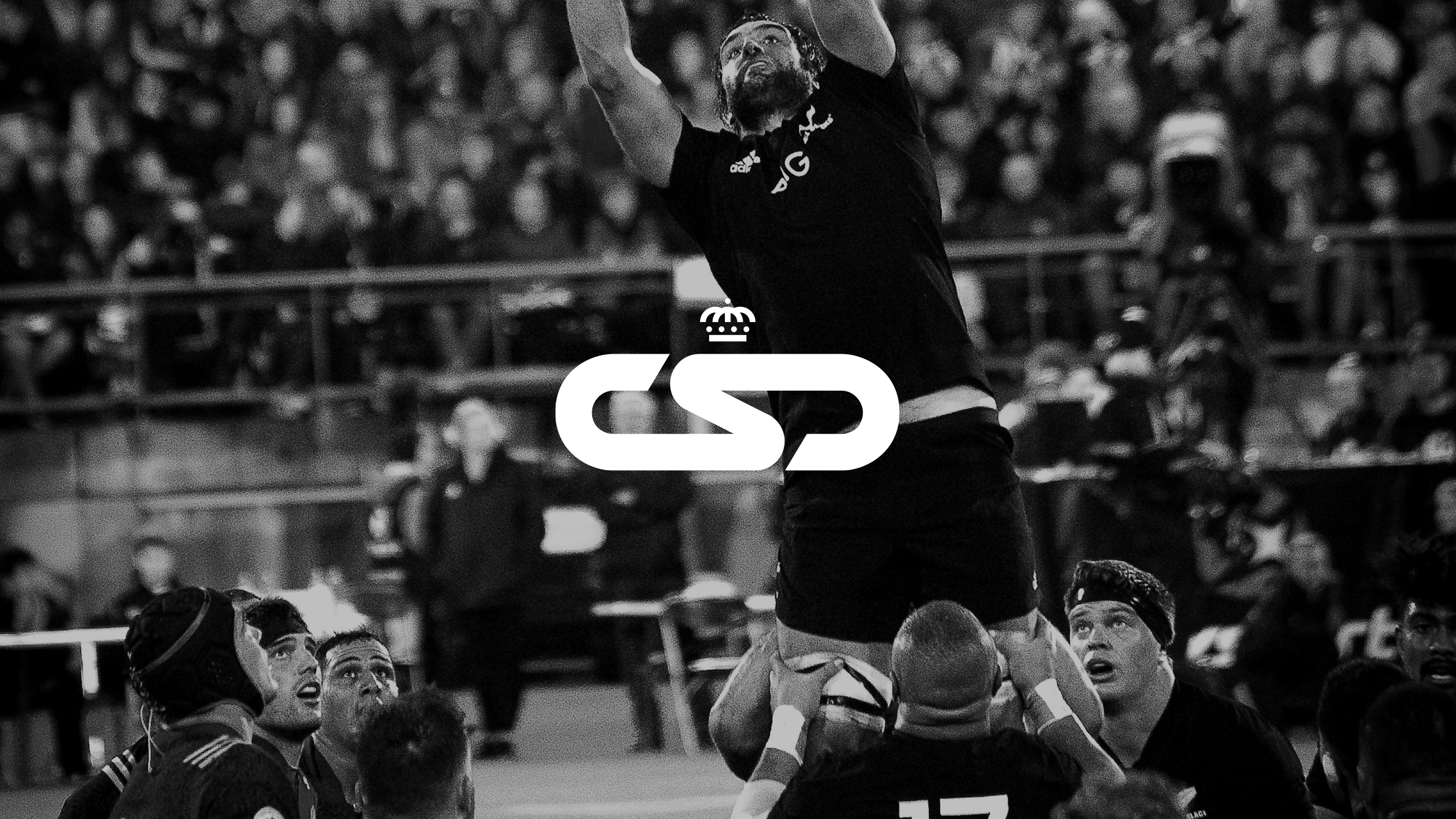
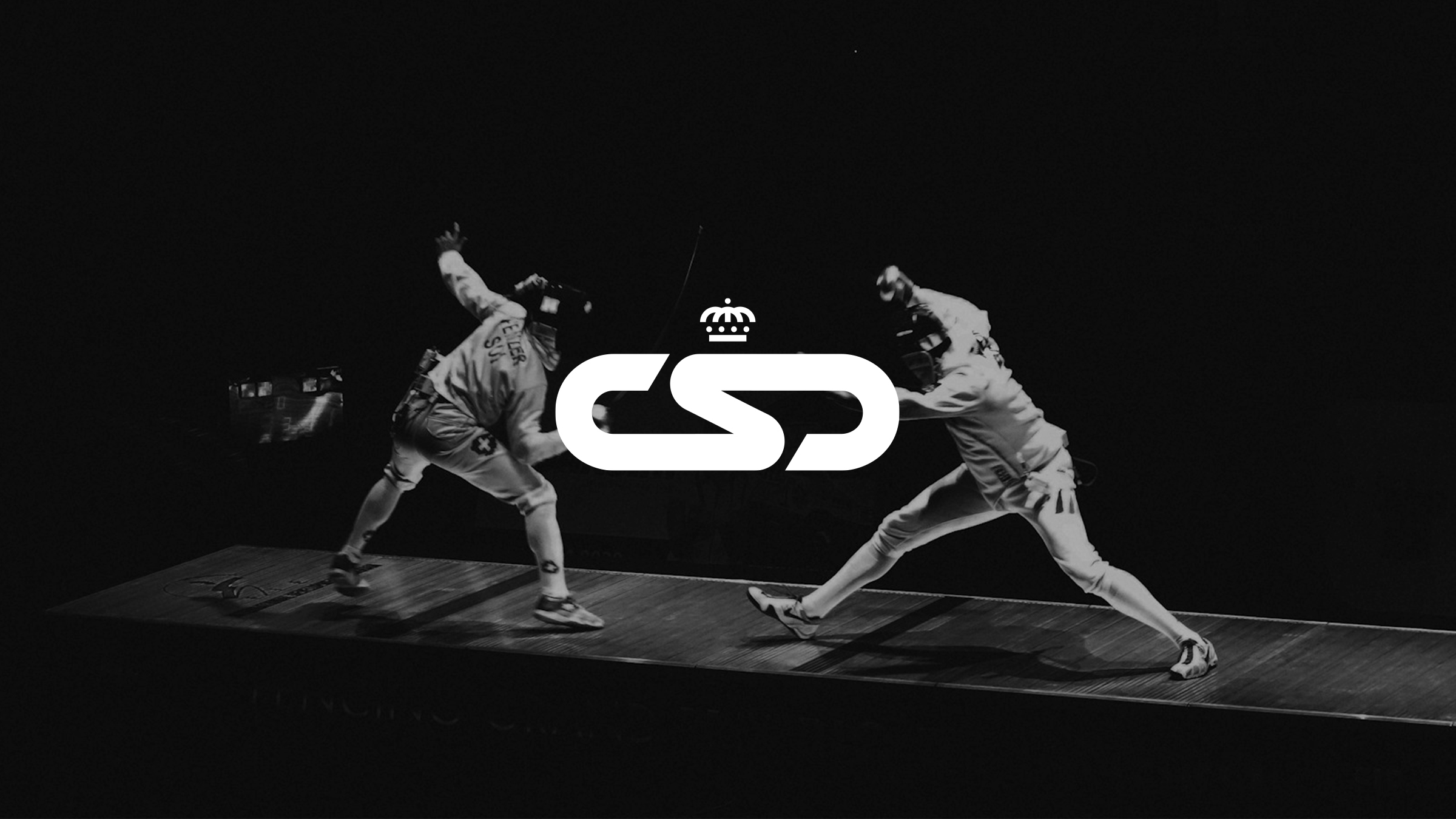
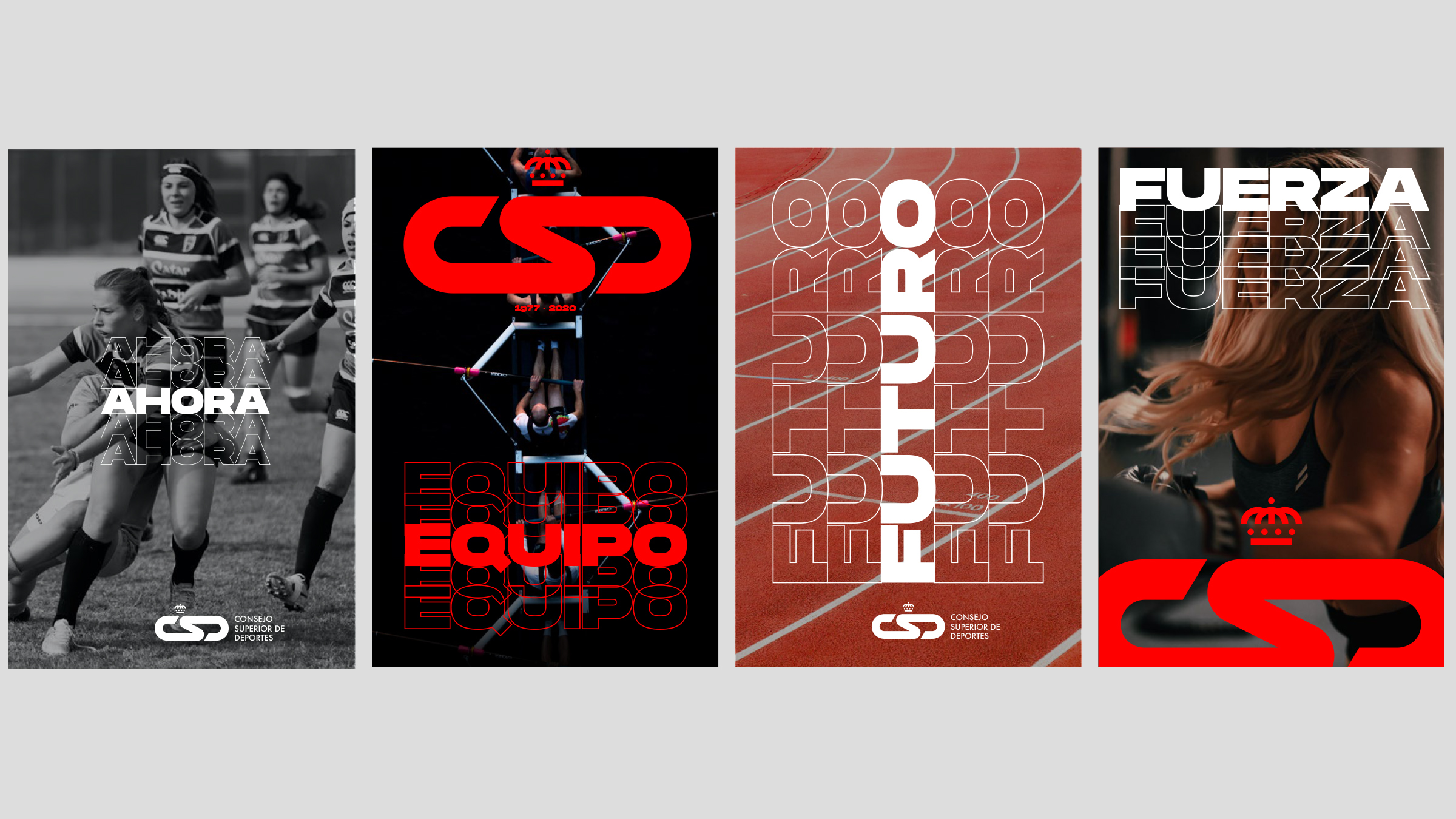
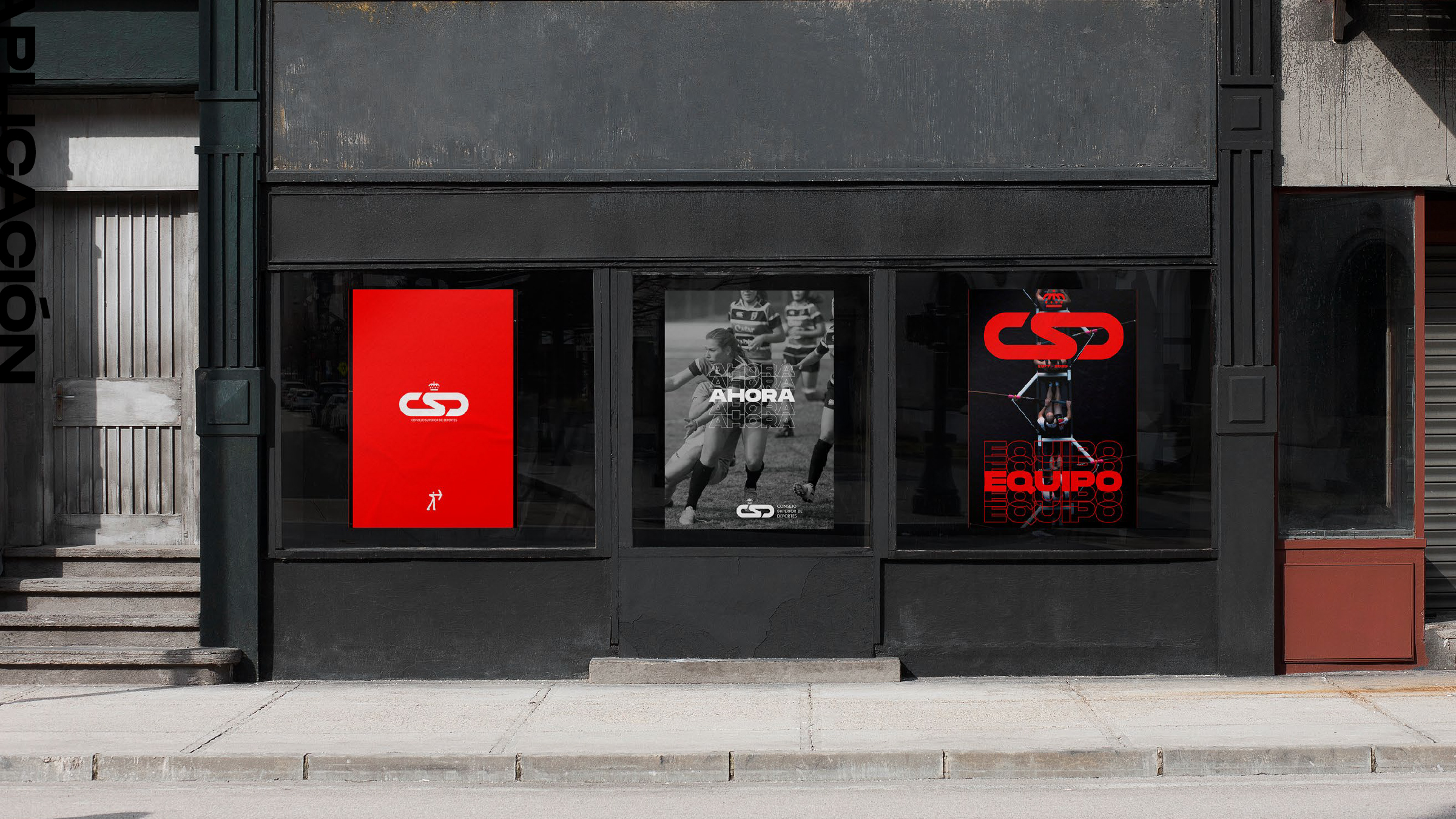
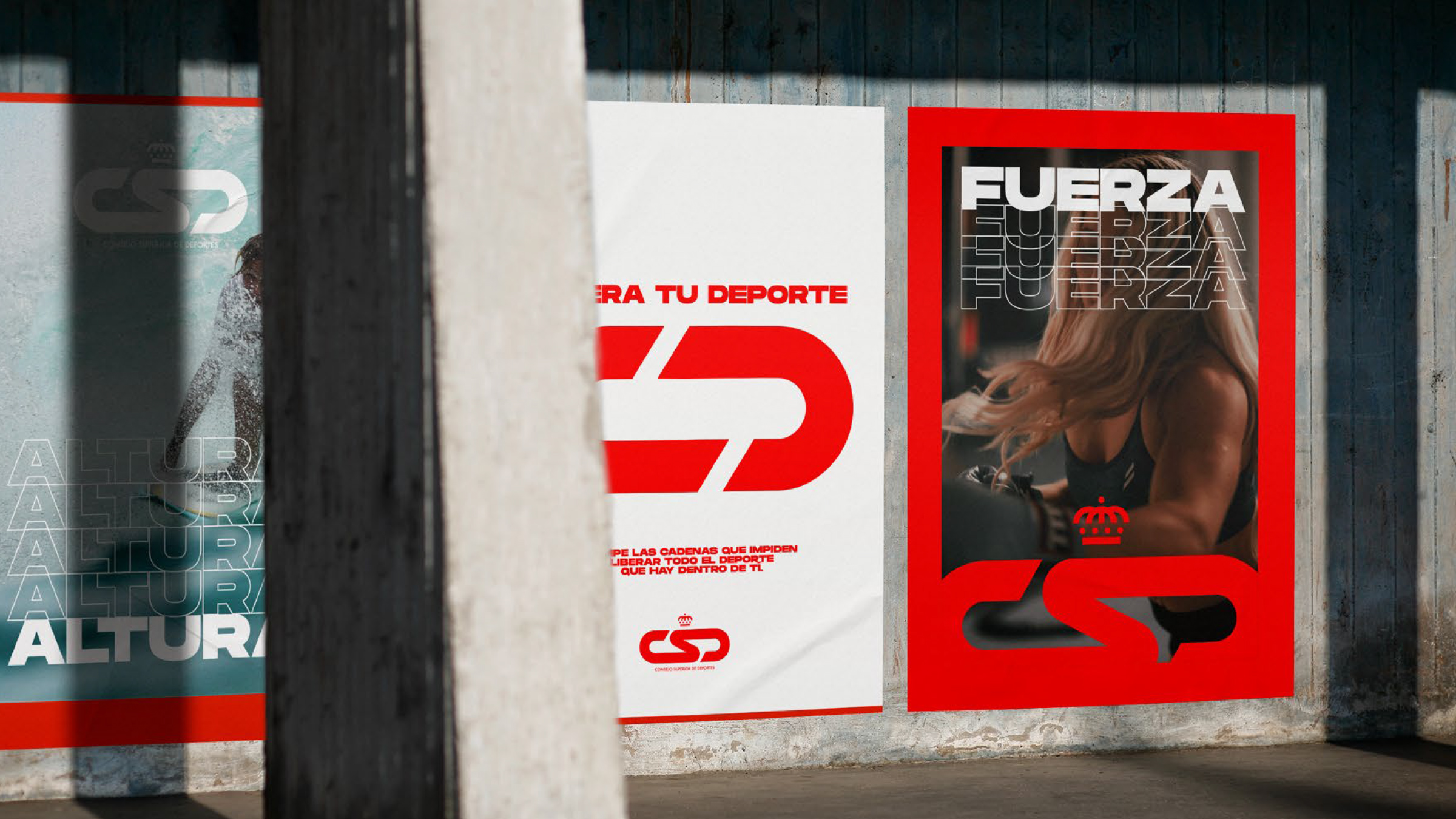
This wasn’t just about redesigning an institutional identity: it was about reshaping how sports are communicated from the public sphere. The project for the Spanish High Council for Sports (CSD) balances institutional sobriety with visual energy, creating a flexible, modern, and inclusive brand system.
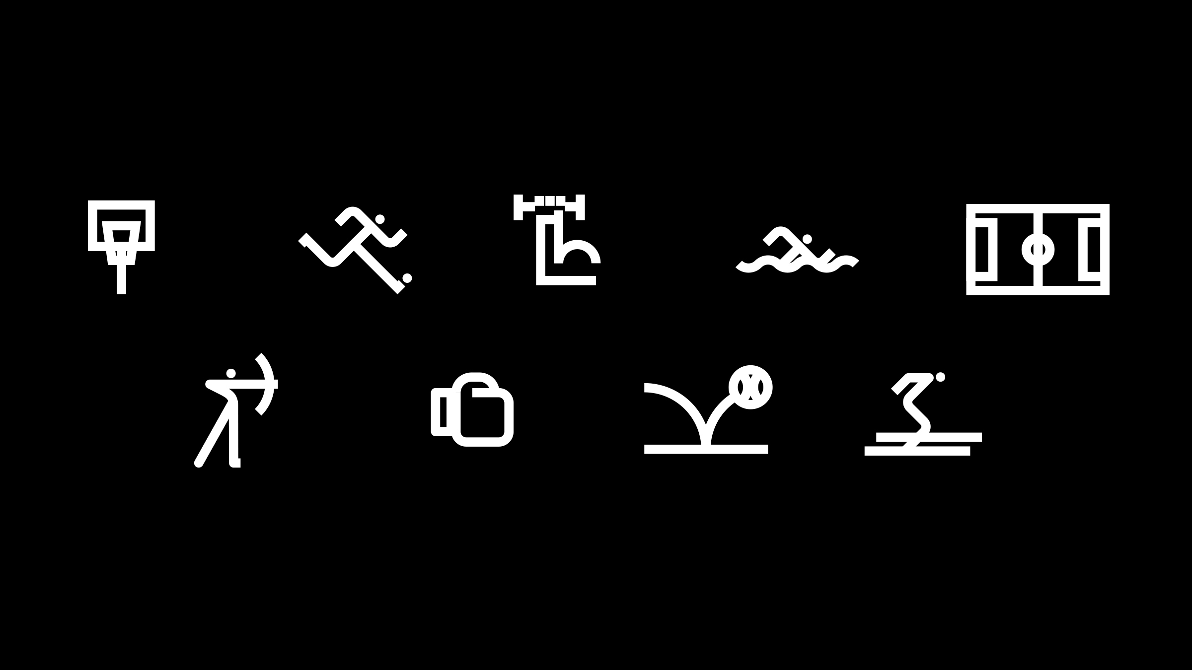
Color plays a key role. A vibrant yet controlled palette was chosen, capable of coexisting with multiple federations and disciplines without imposing a single aesthetic. The modular composition of the visual system reflects that diversity — individual elements functioning within a shared structure.
Aesthetically, the brand moves between technical precision and human rhythm. There is calculation in the design, but also a choreographic flow in its rollout. You see it in the layouts, the active typography, the visual language that calls for movement.
The value of this project lies in its cultural and political reach: how a public brand can activate a collective identity without clichés or solemnity. It’s a system that gives voice to the present, without losing sight of its institutional role.