ART DIRECTION
LA LIGA
A Global Brand with a Round Soul
Redesigning La Liga’s identity meant intervening in one of Spain’s most powerful cultural symbols. The challenge was monumental: to give a new face to a global brand, without losing its spirit, symbolic strength, or legacy.
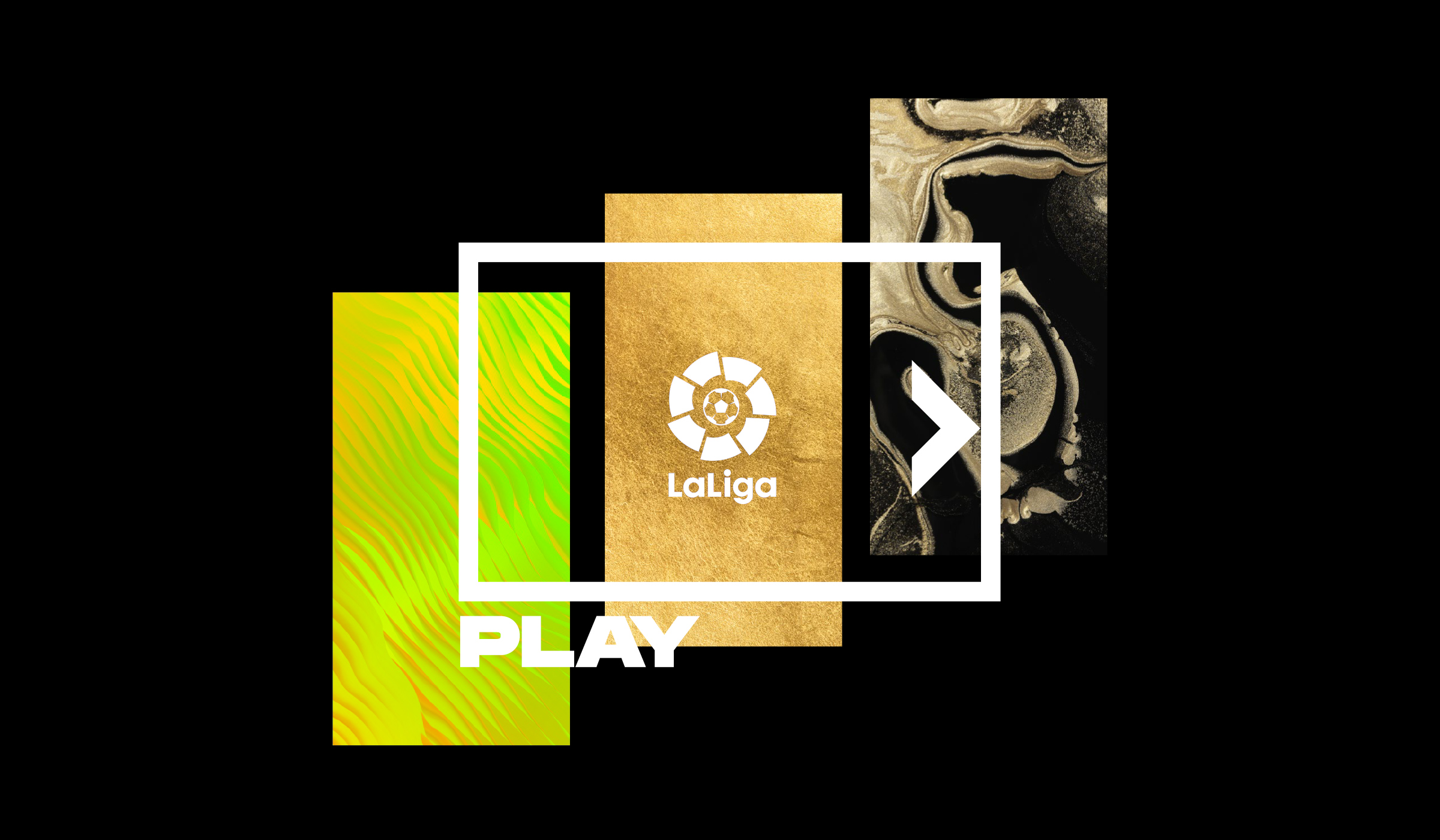
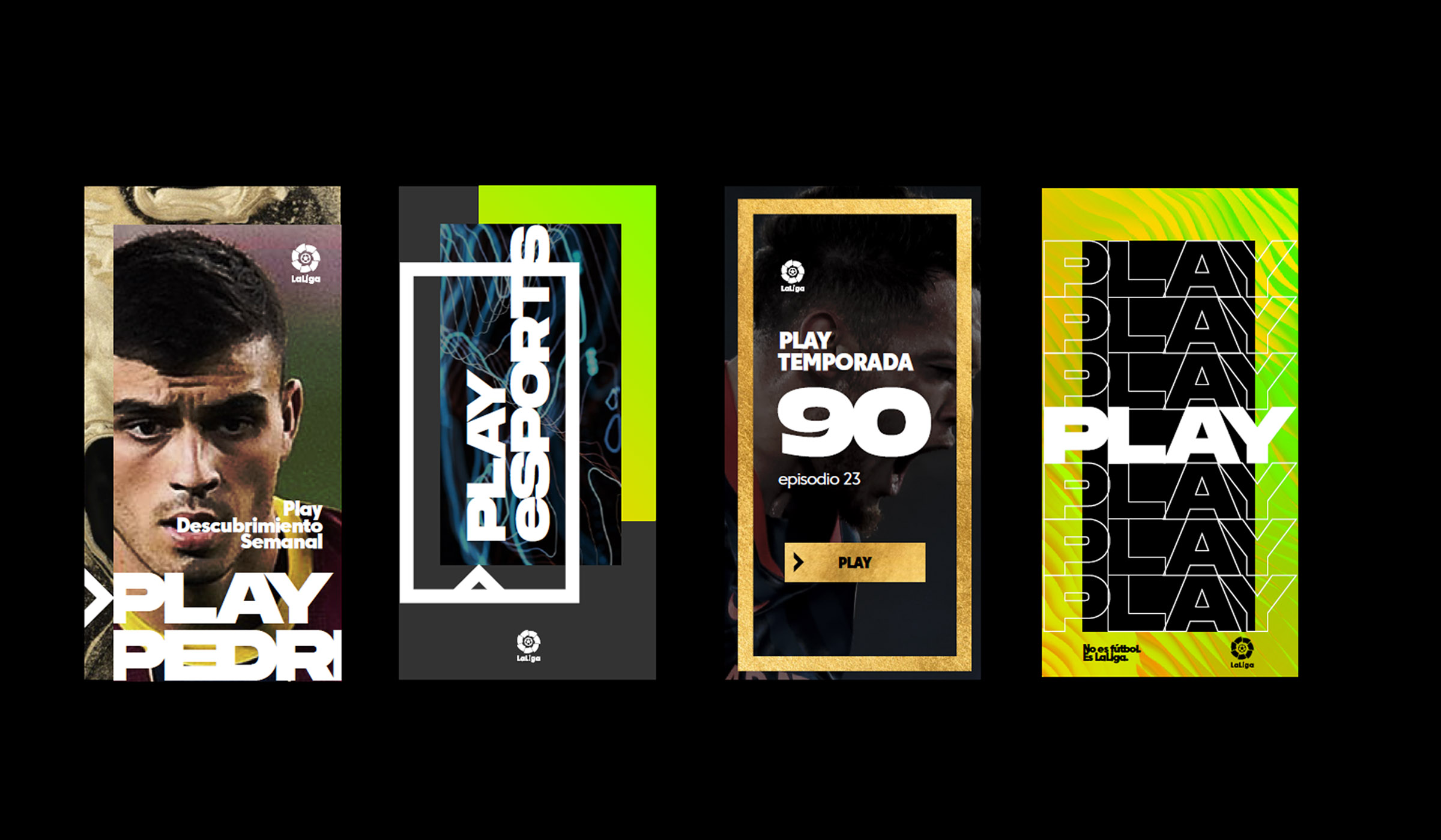
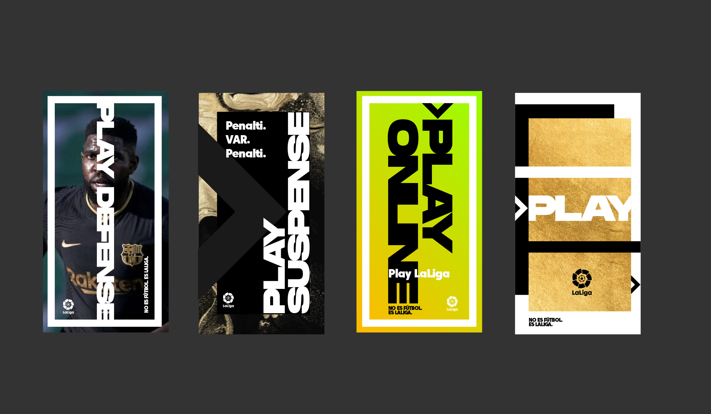
The solution is precise: a strong minimalist approach, with clean forms and bold geometry that can be animated, scaled, and applied to any format. The central circle references the ball, the field, the cycle of competition — anchoring the entire system.
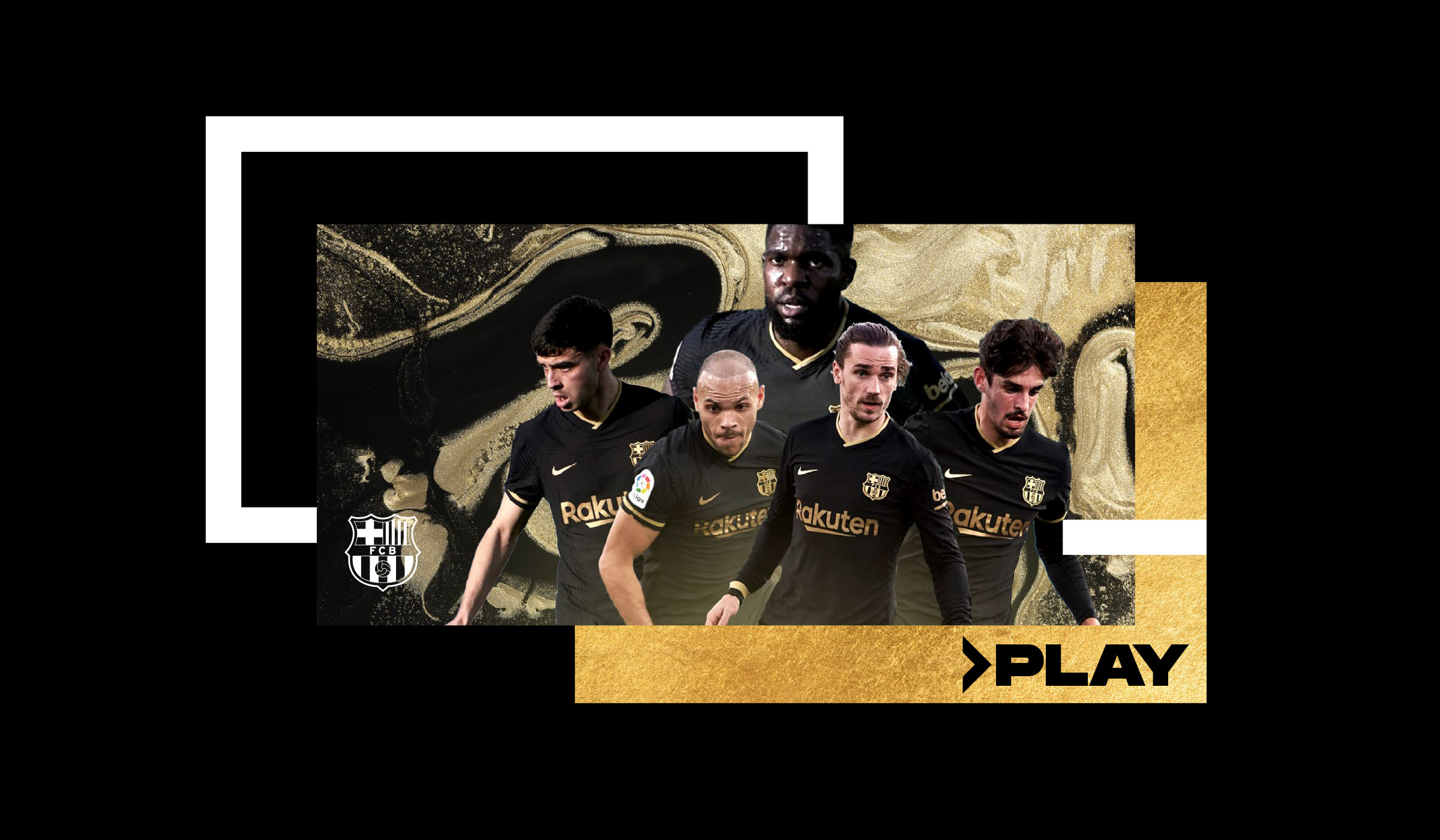
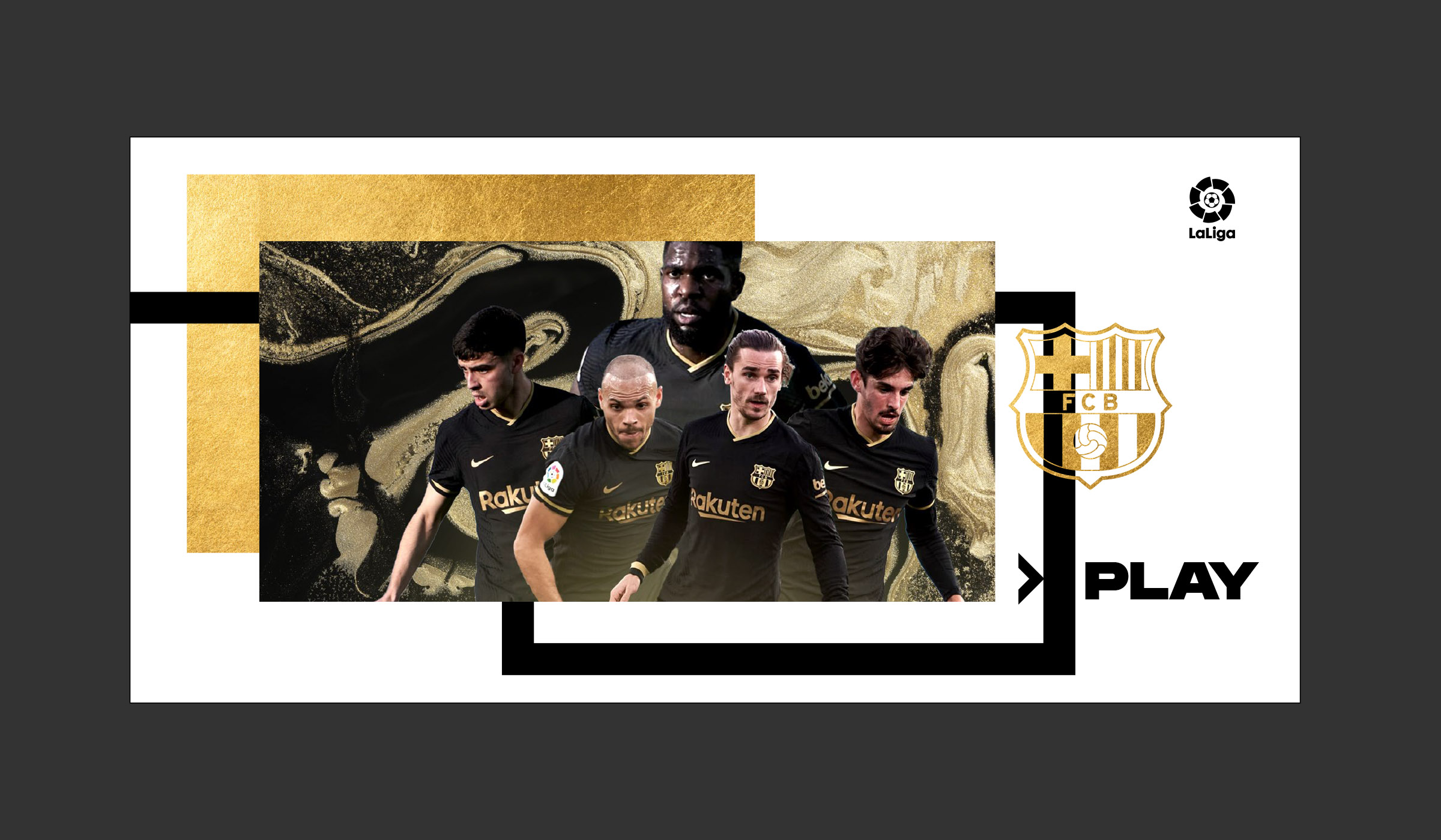
Color was strategically reduced to enhance impact and instant recognition. The typography is versatile and confident, deployed in a visual system capable of coexisting with clubs, events, and high-traffic digital platforms.
This project stands out for how it synthesizes passion, competition, and technology in a single brand. La Liga becomes more than a league — it’s a global visual identity that evolves with the rhythm of the entertainment industry.


