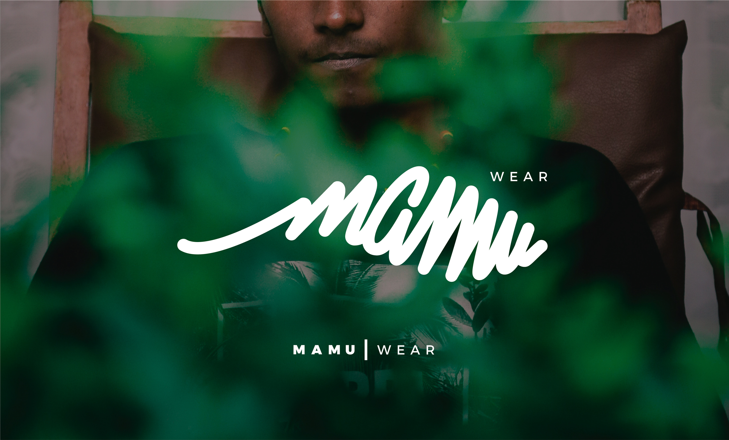
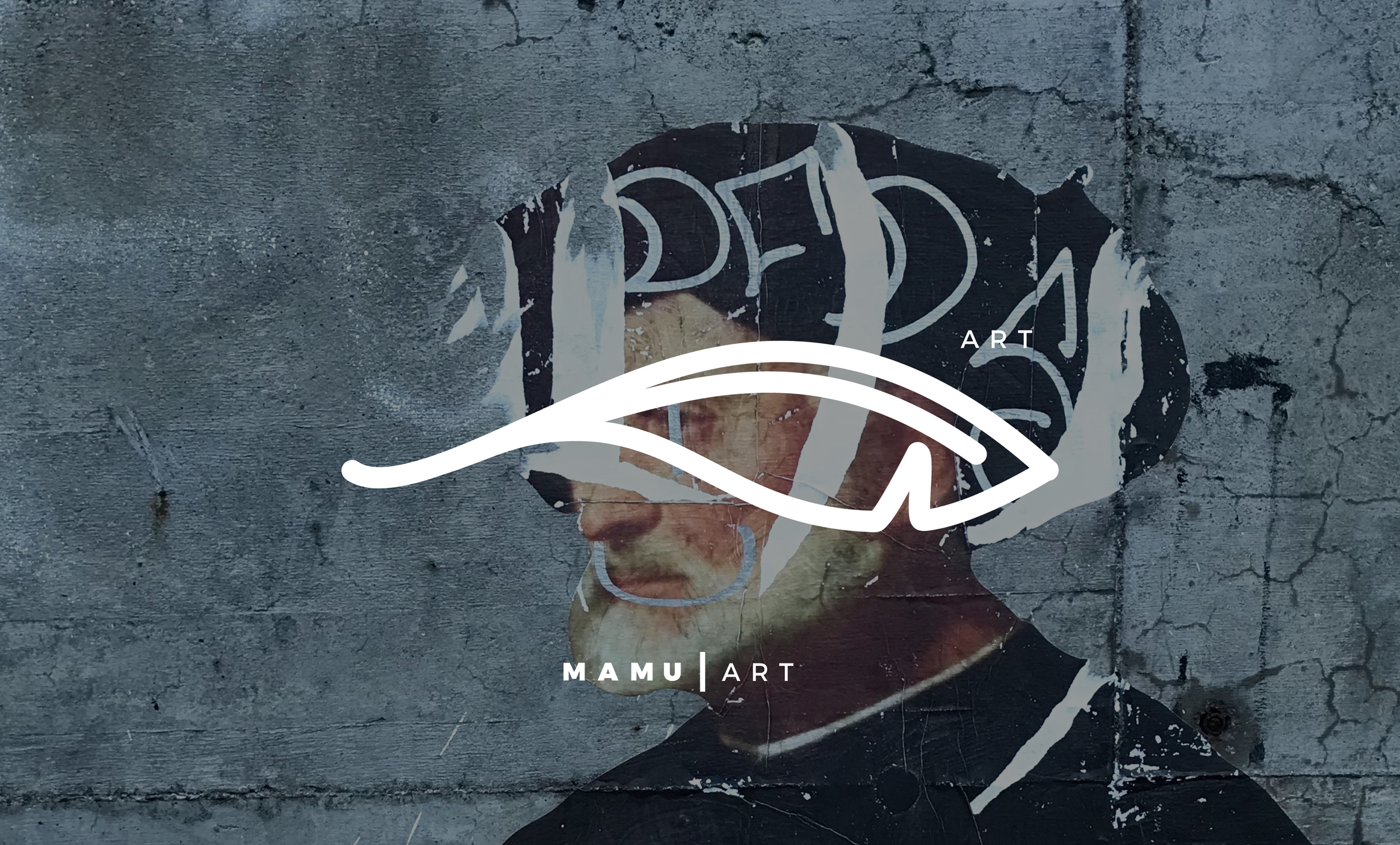
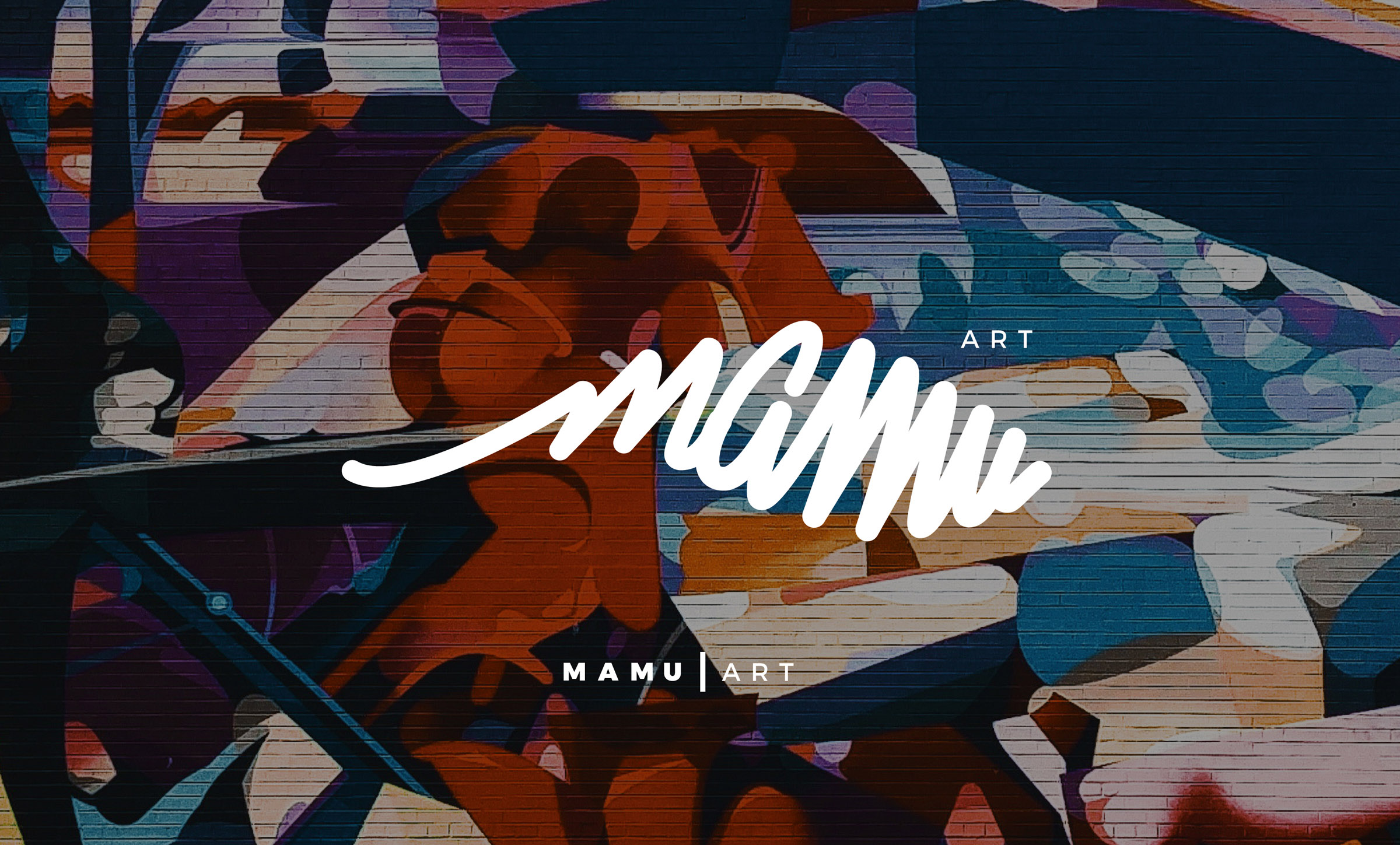
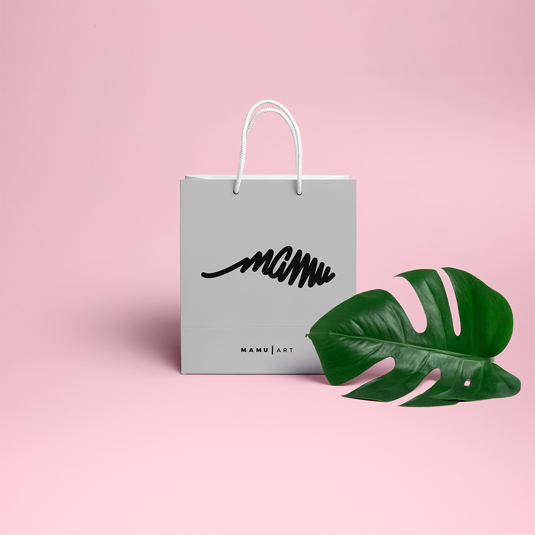
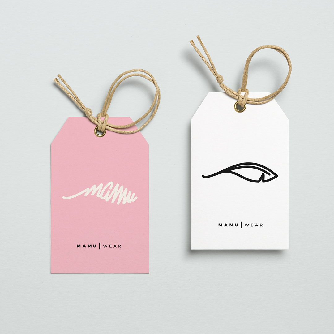
MAMU
Graphic Chaos, Creative Control
/ Inspiring with design
MAMU’s identity is anything but predictable. Irreverent, vibrant, and packed with pop-infused expressiveness, it’s designed from a place of creative rebellion—a brand that celebrates art and chaos as part of the same vital system.
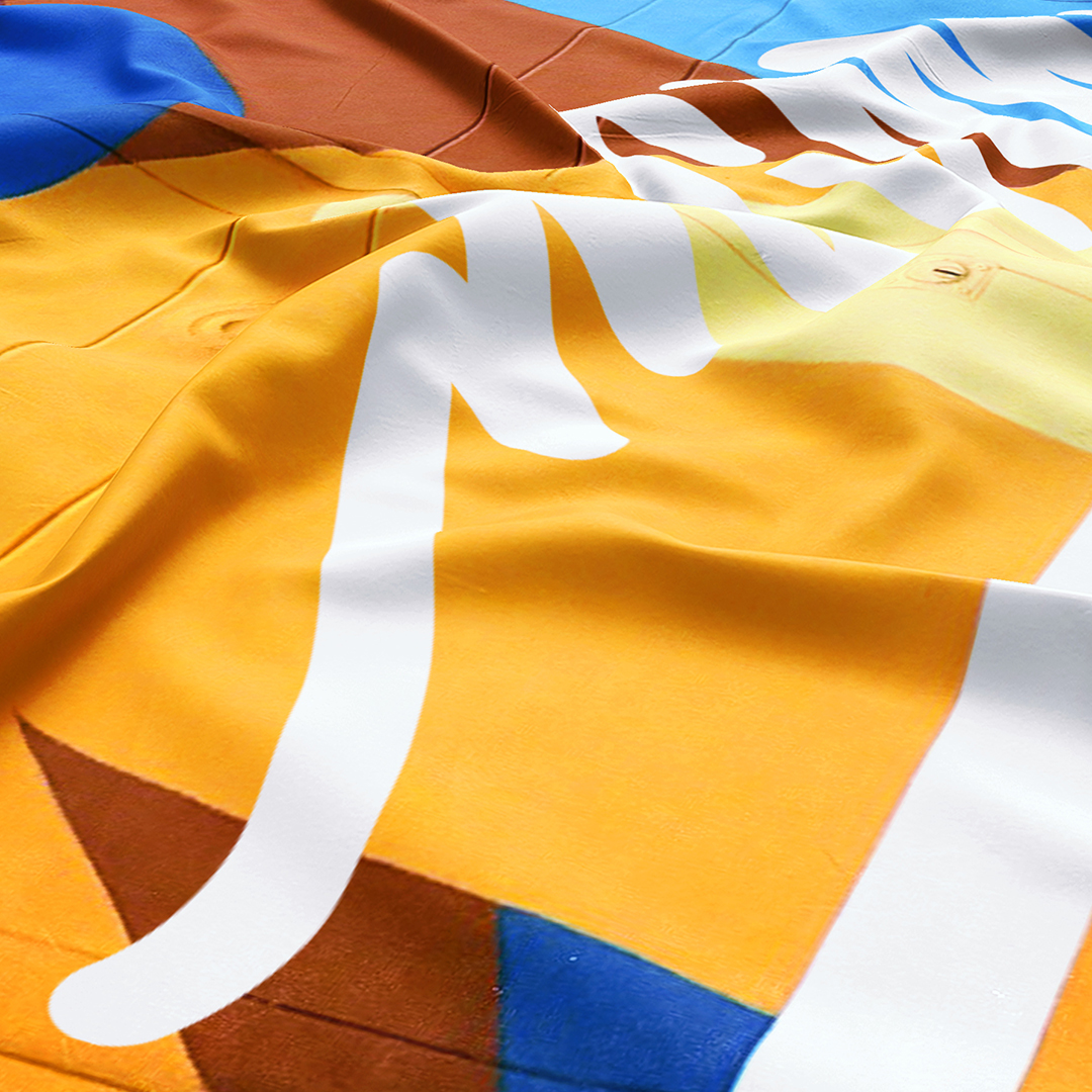
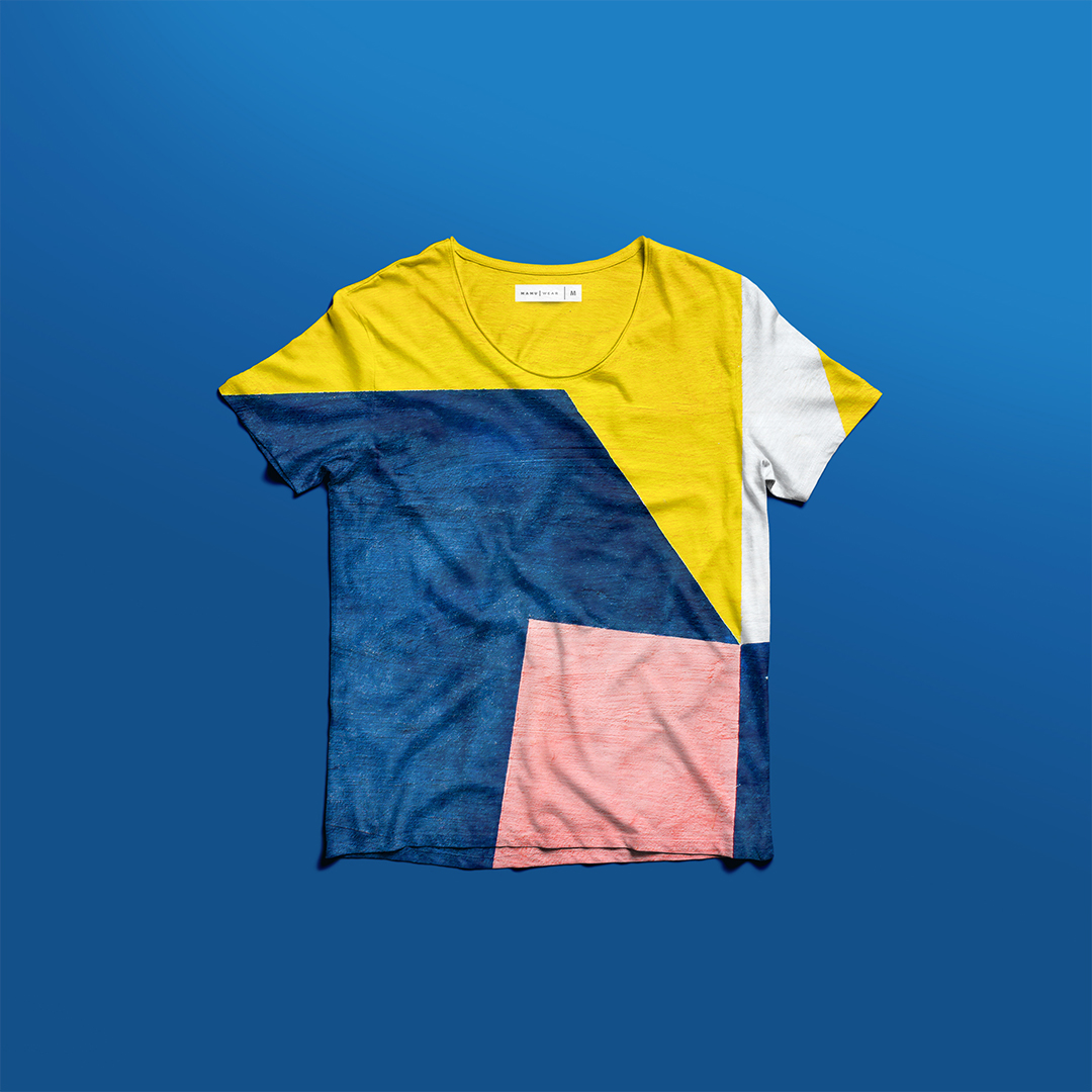
Here, color takes the lead. Electric hues clash with deep saturations, while typography plays with cut-outs, overlays, and distortion. The result is a visual universe that is playful, provocative, and instantly recognizable.
Compositions follow their own logic—almost anti-design—which is precisely what makes them stand out. The brand comes alive as a graphic language, not a static logo. It expands, reacts, and never repeats.
MAMU represents the kind of client that lets you push graphic design to its expressive limits, treating visual identity not just as function, but as creative gesture. It’s a brand with attitude—and that becomes its most powerful design asset.