Overview
Branding
Visual design
An Identity to Inhabit Time
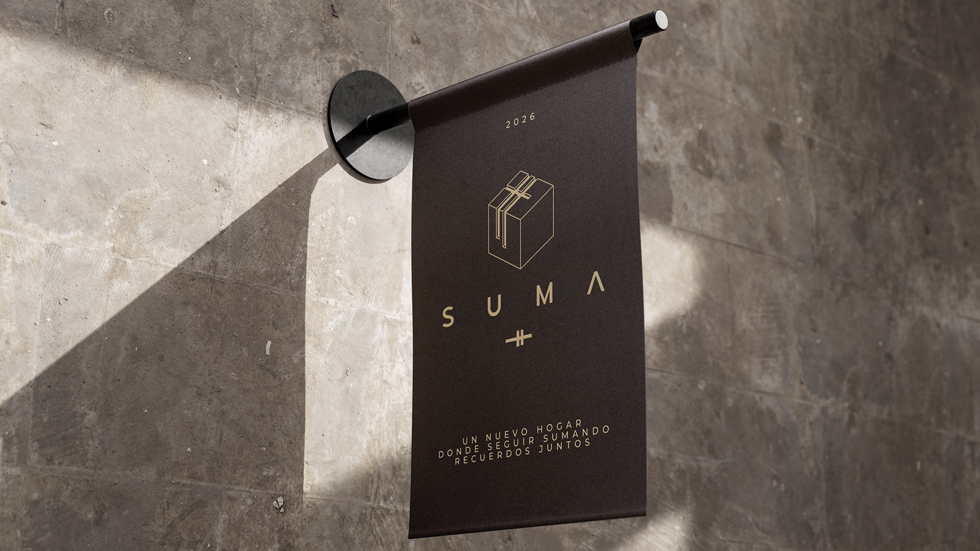
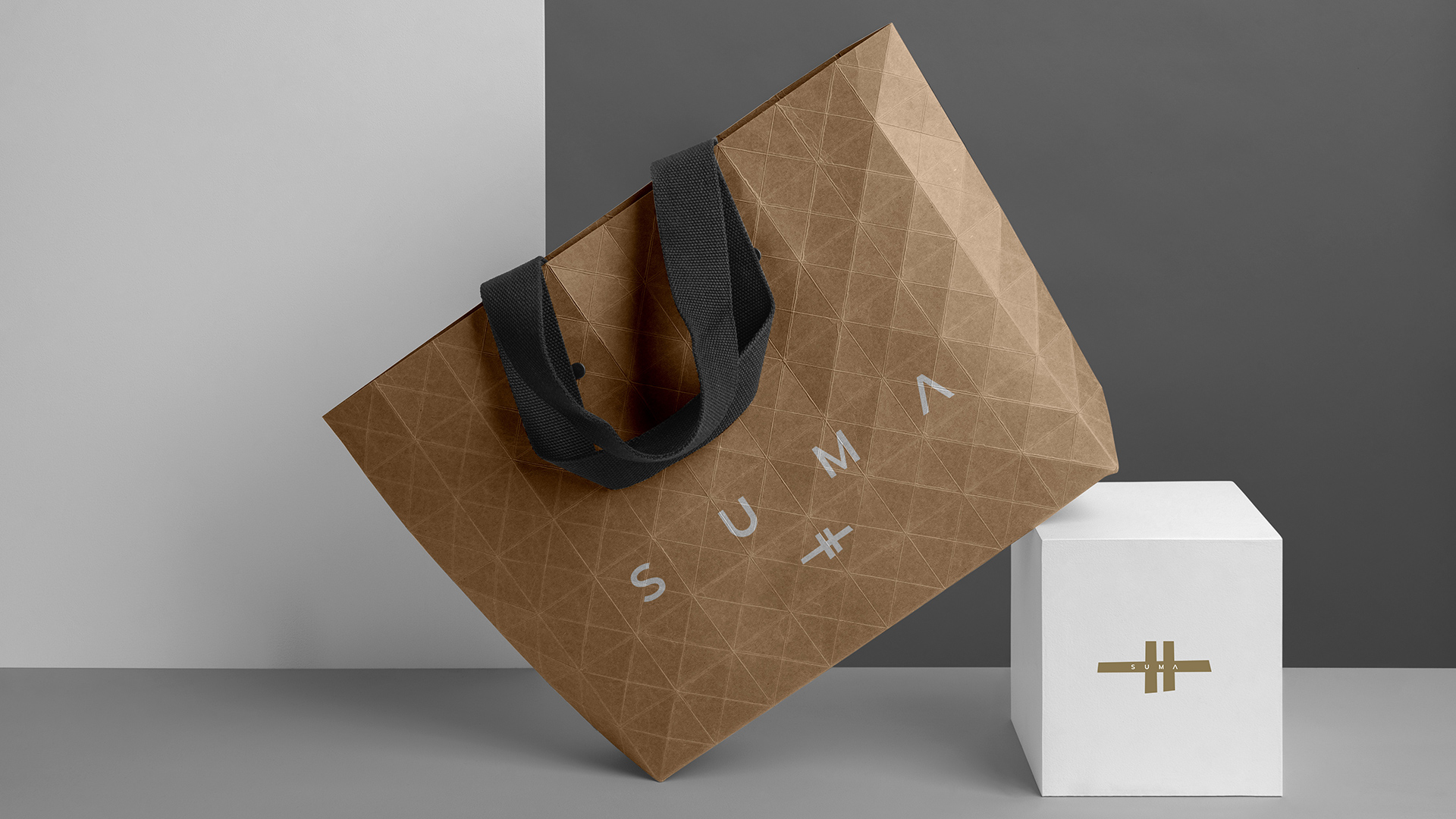
SUMA is born as both a physical and emotional space, designed for a delicate yet vital stage: the pre-senior years. The identity is built on a deep concept — to add memories, add connection, add presence. Every part of the visual system reflects this symbolic purpose, with a sober, spiritual, and emotionally resonant aesthetic.
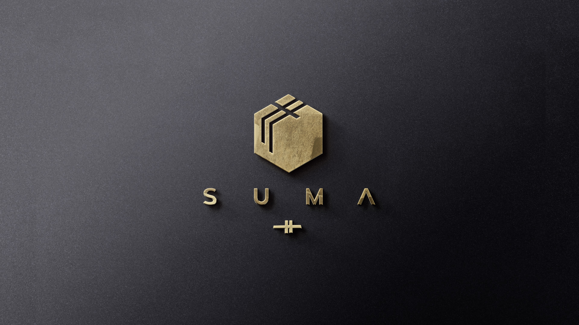
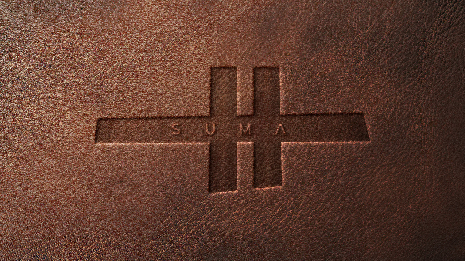
The number 11, representing connection and balance, becomes the graphic root of the logo. References to Chillida, the interplay between matter and void, and the cross as a universal care symbol, shape an identity that is contemporary yet almost ritualistic, conveying warmth without clichés.
/ Inspiring with design
This project is important because it doesn’t just design a brand — it designs a language of care. SUMA doesn’t shout or compete; it embraces. It’s a visual system created to age with dignity, and to inhabit time with purpose and beauty.
THE COMPLEXITY
/ Inspiring with design
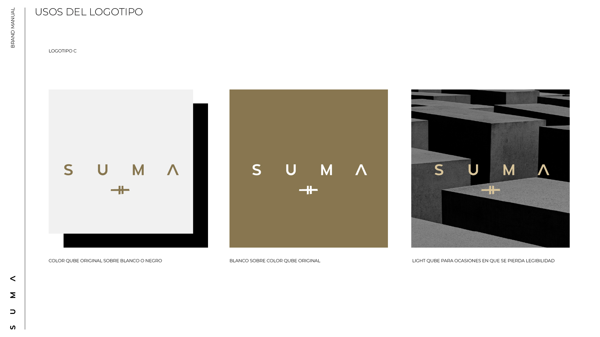
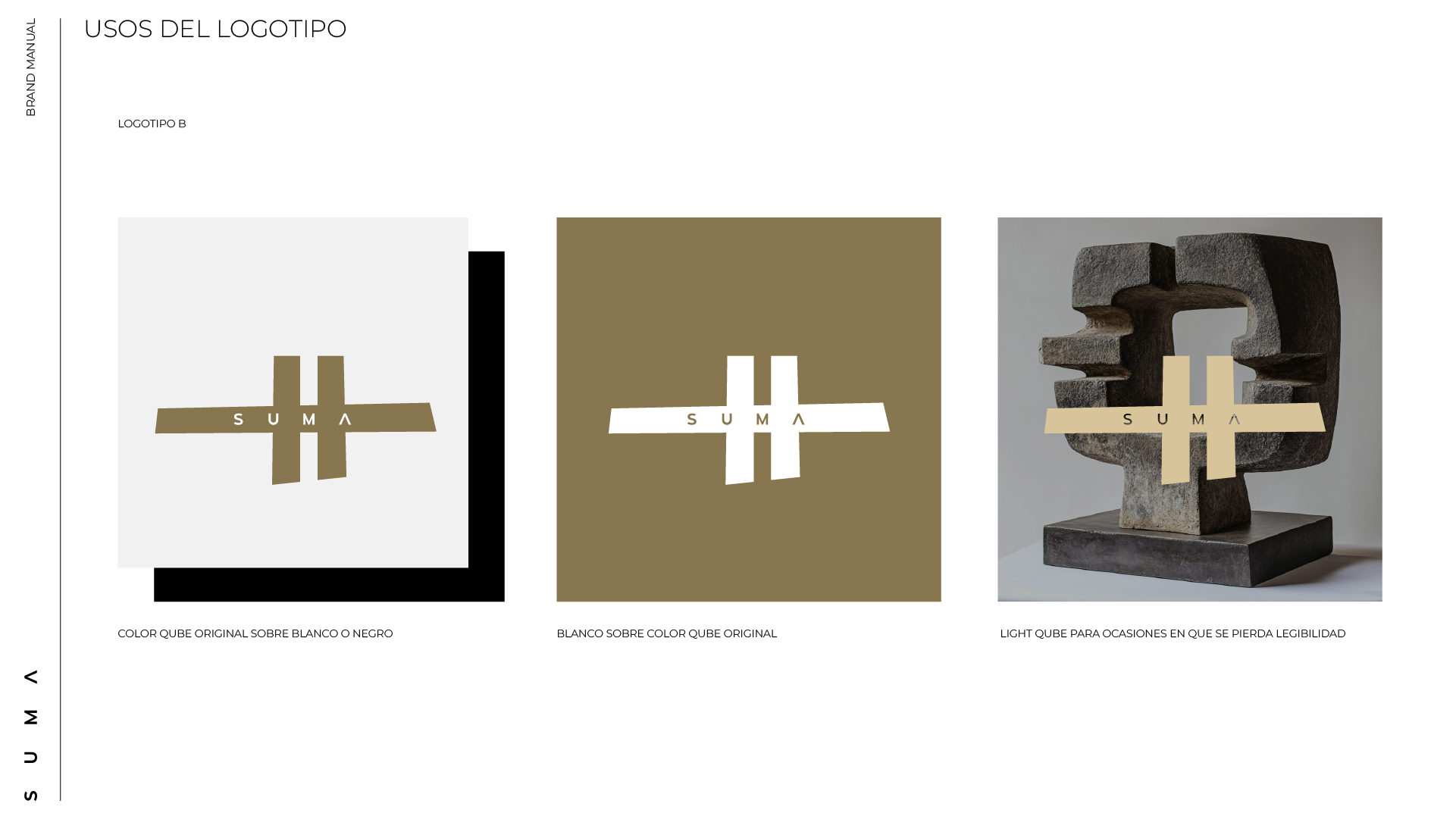
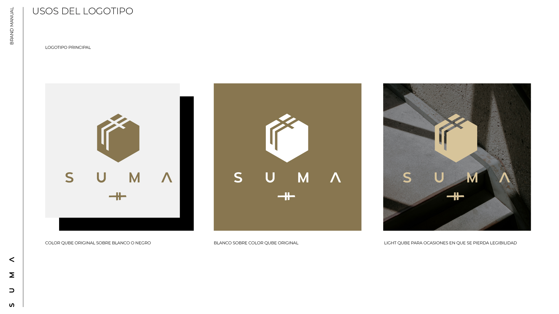
Creating a visual identity is always a challenge. But designing a brand capable of articulating three distinct versions of its logotype — while maintaining emotional and aesthetic coherence — takes the challenge to a higher level. SUMA is an exercise in graphic synthesis and conceptual sensitivity, adapting its form without losing its essence.
This versatility is not just technical — it’s deeply strategic. It allows the brand to move fluidly across digital, architectural and editorial spaces. It scales, shifts, adjusts… but never loses its message.
SUMA proves that a brand doesn’t need to be rigid to be strong. On the contrary: its strength lies in its ability to adapt. It’s an identity that understands today’s reality — that to communicate effectively is to transform without losing authenticity.
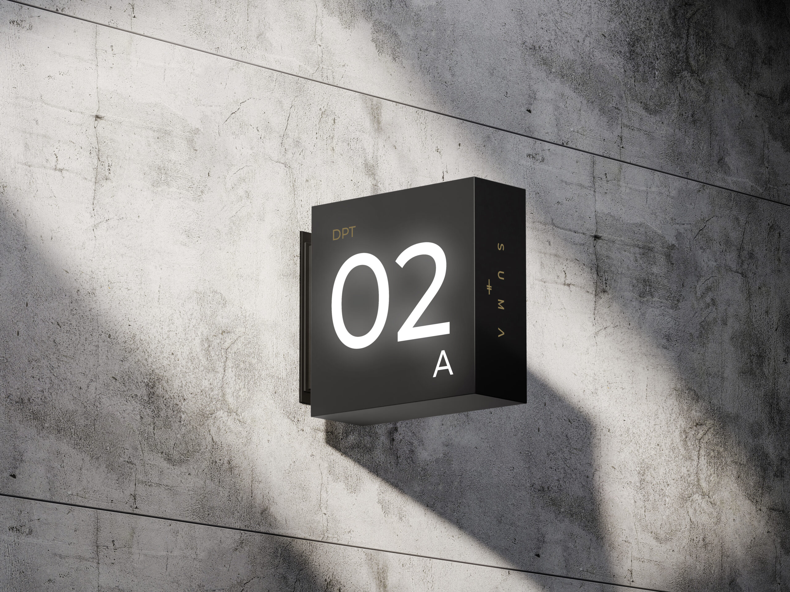
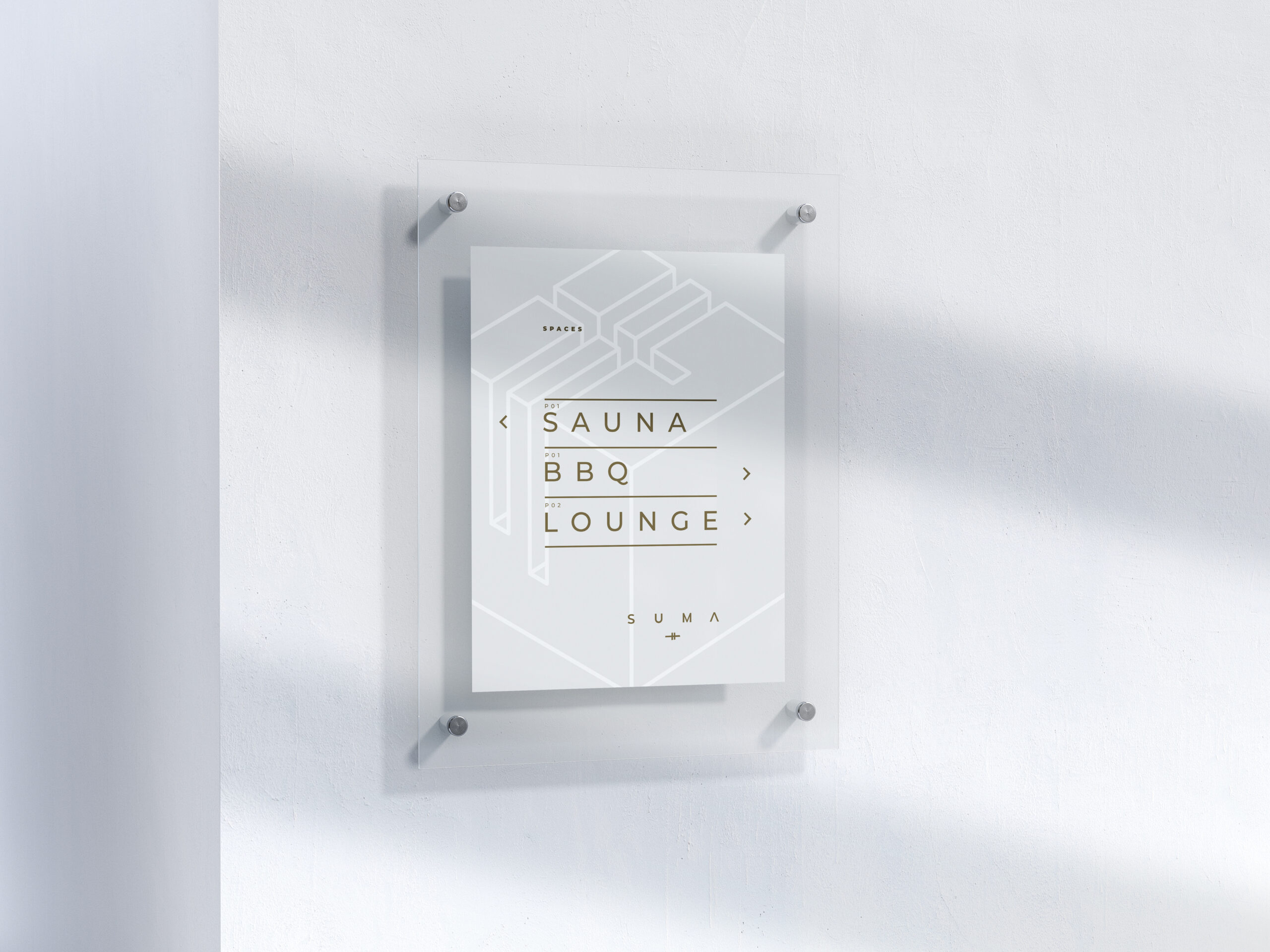
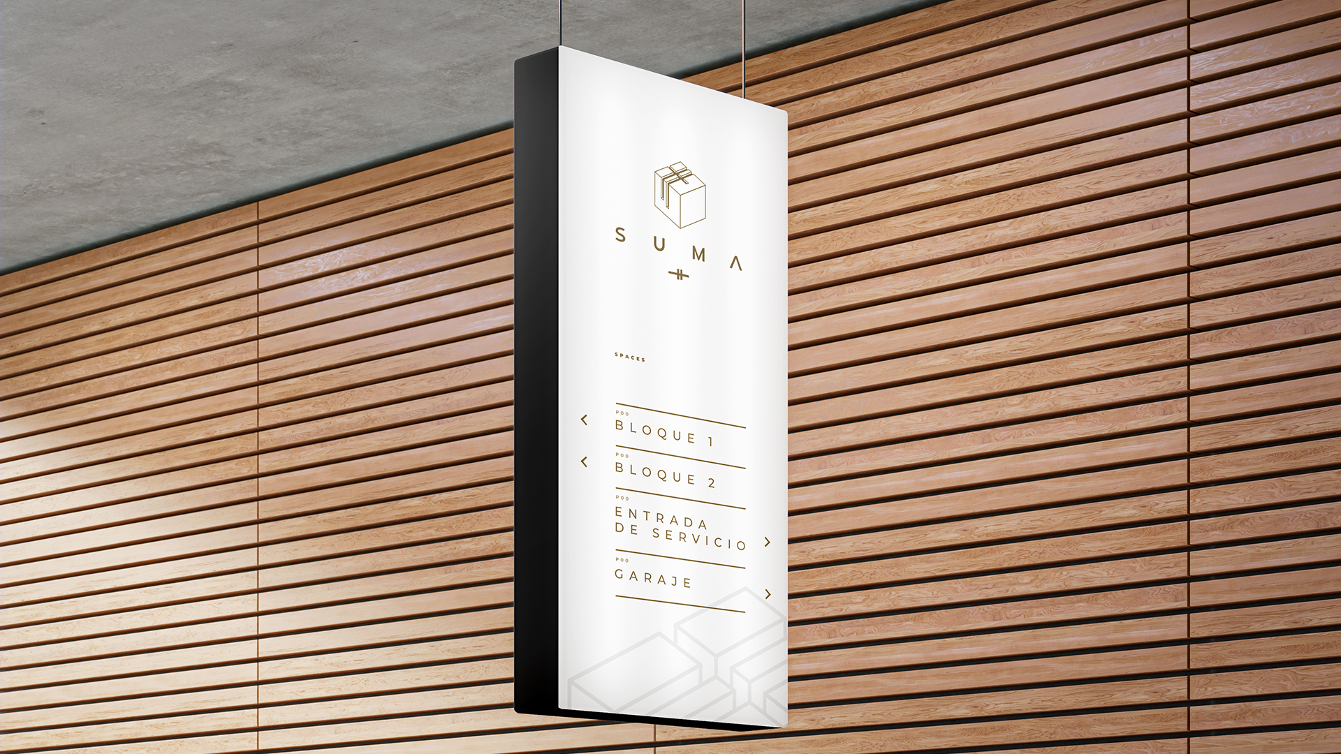
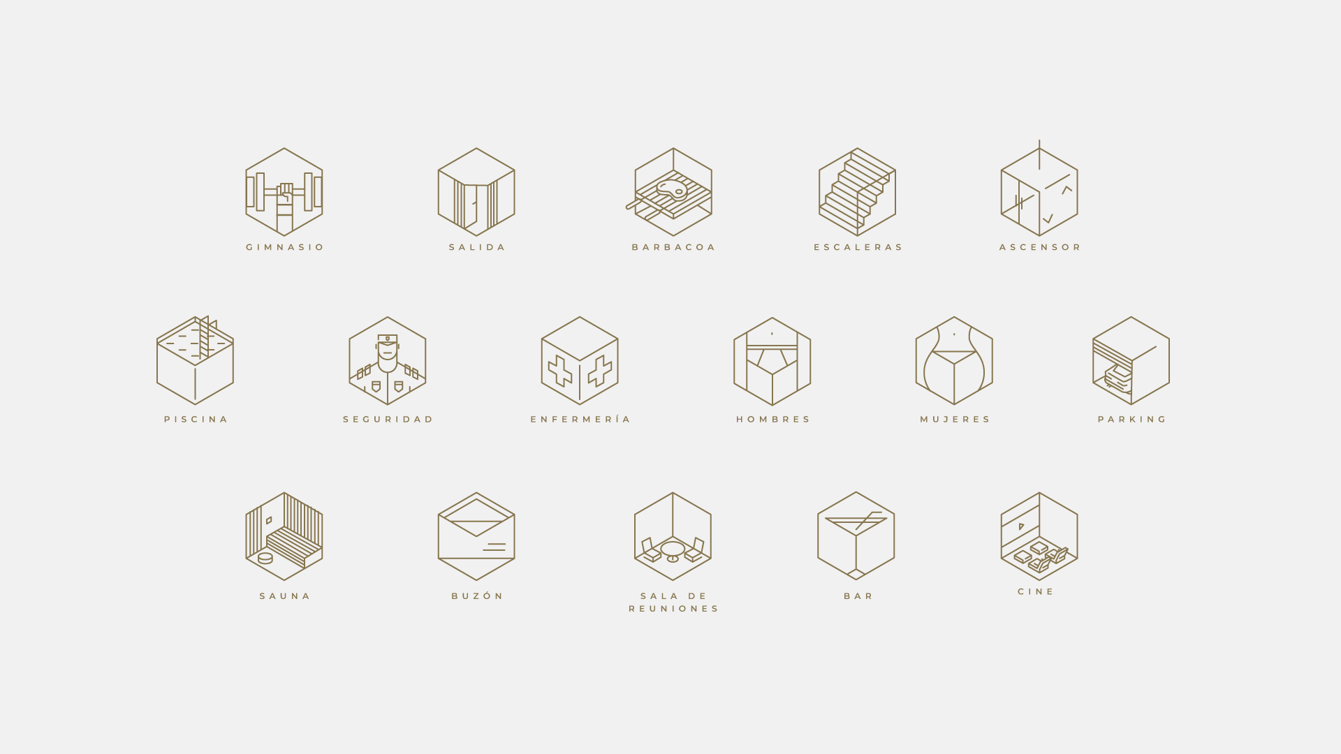
Iconography
& SIGNAGE
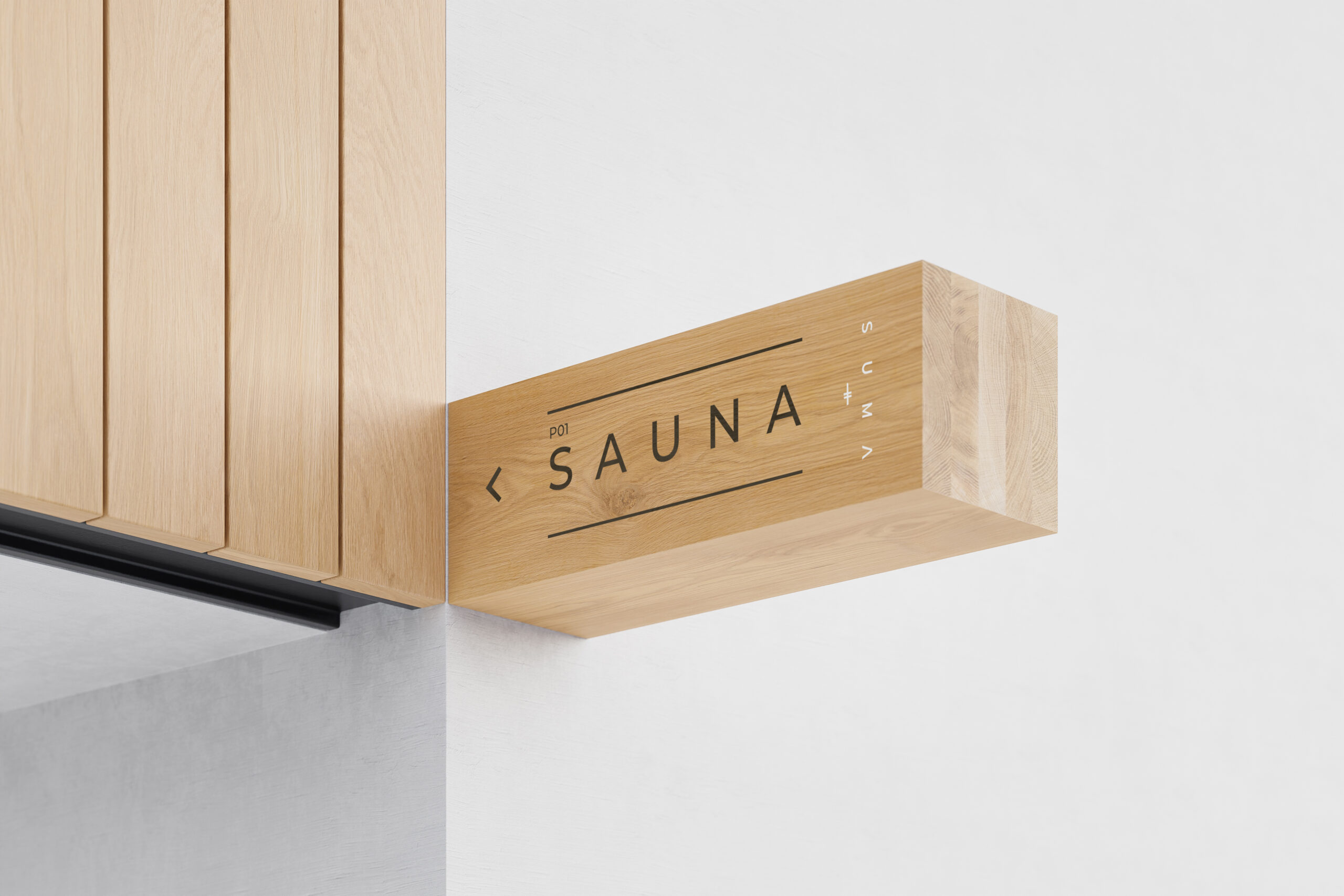
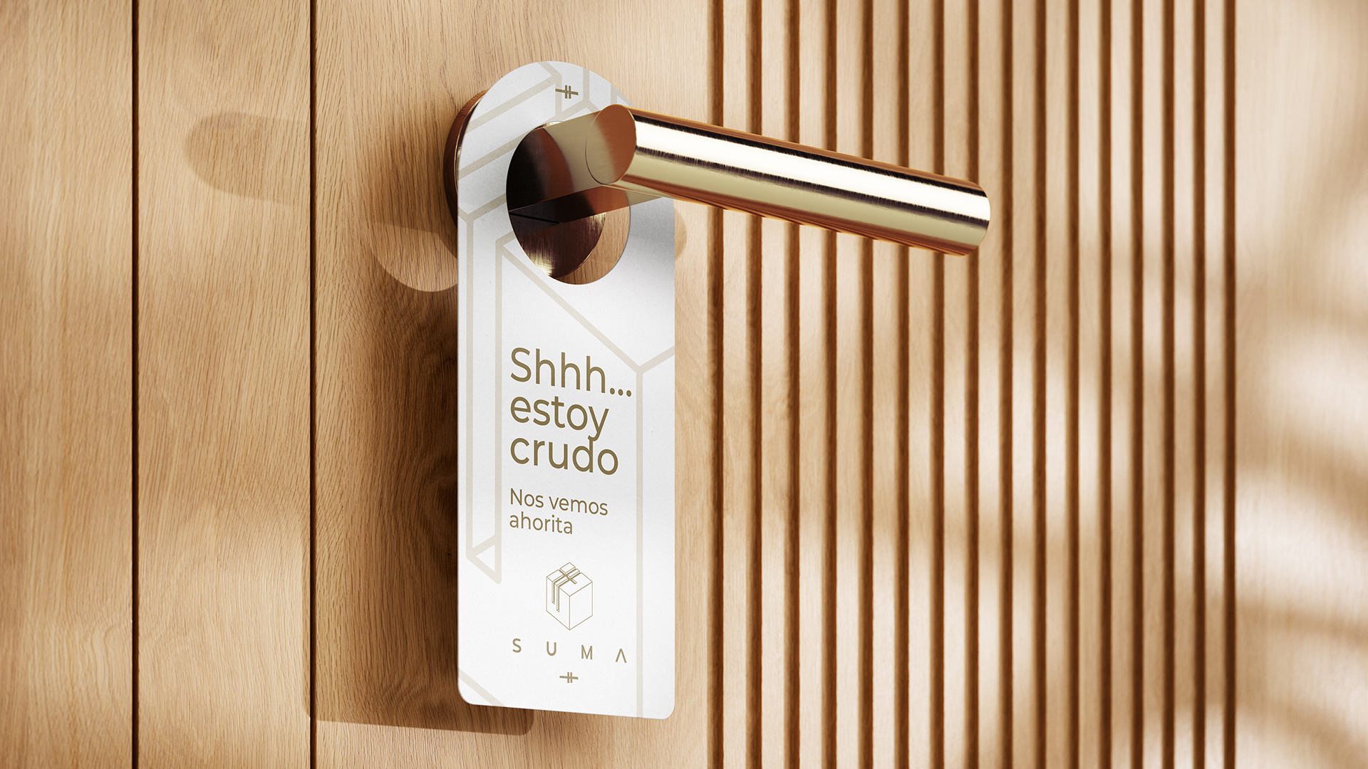
Physical
& PRINTED