Overview
Branding
Visual design
Design that Beats in BPM
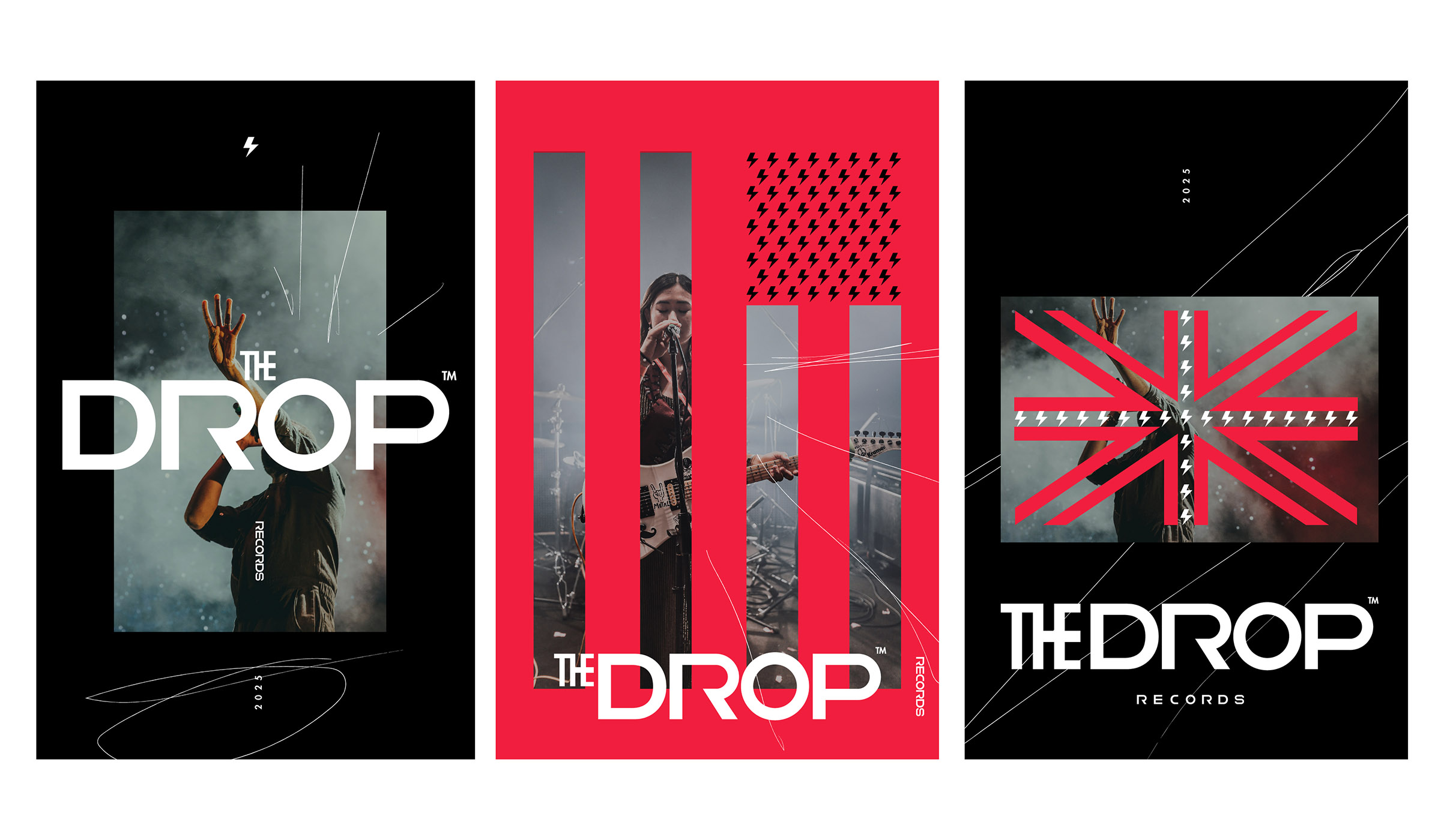
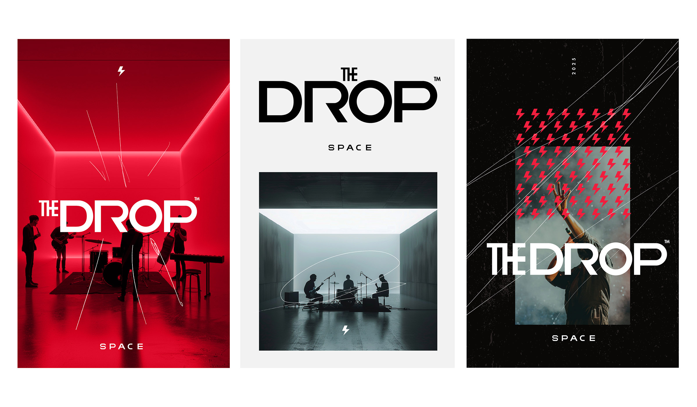
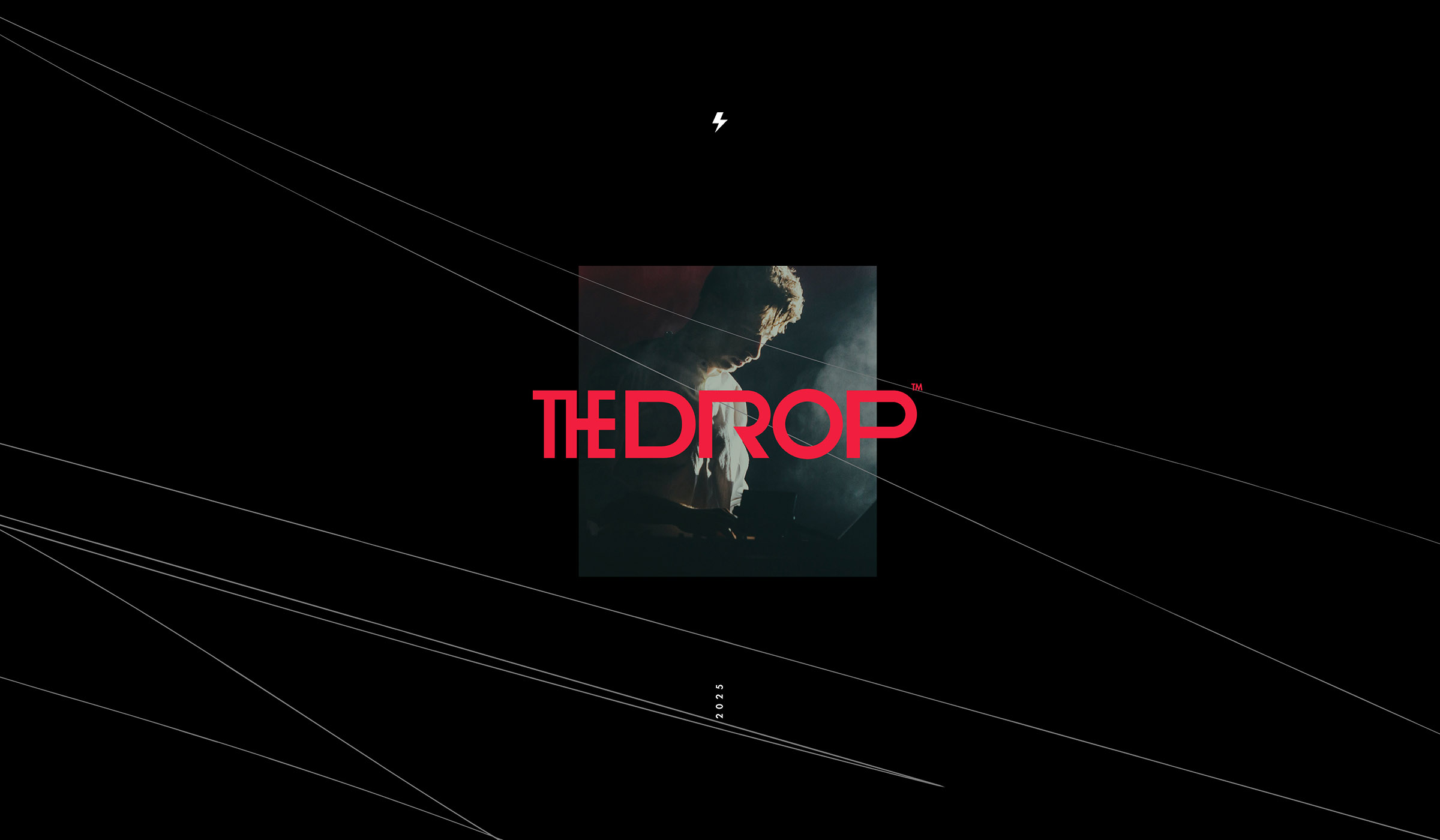
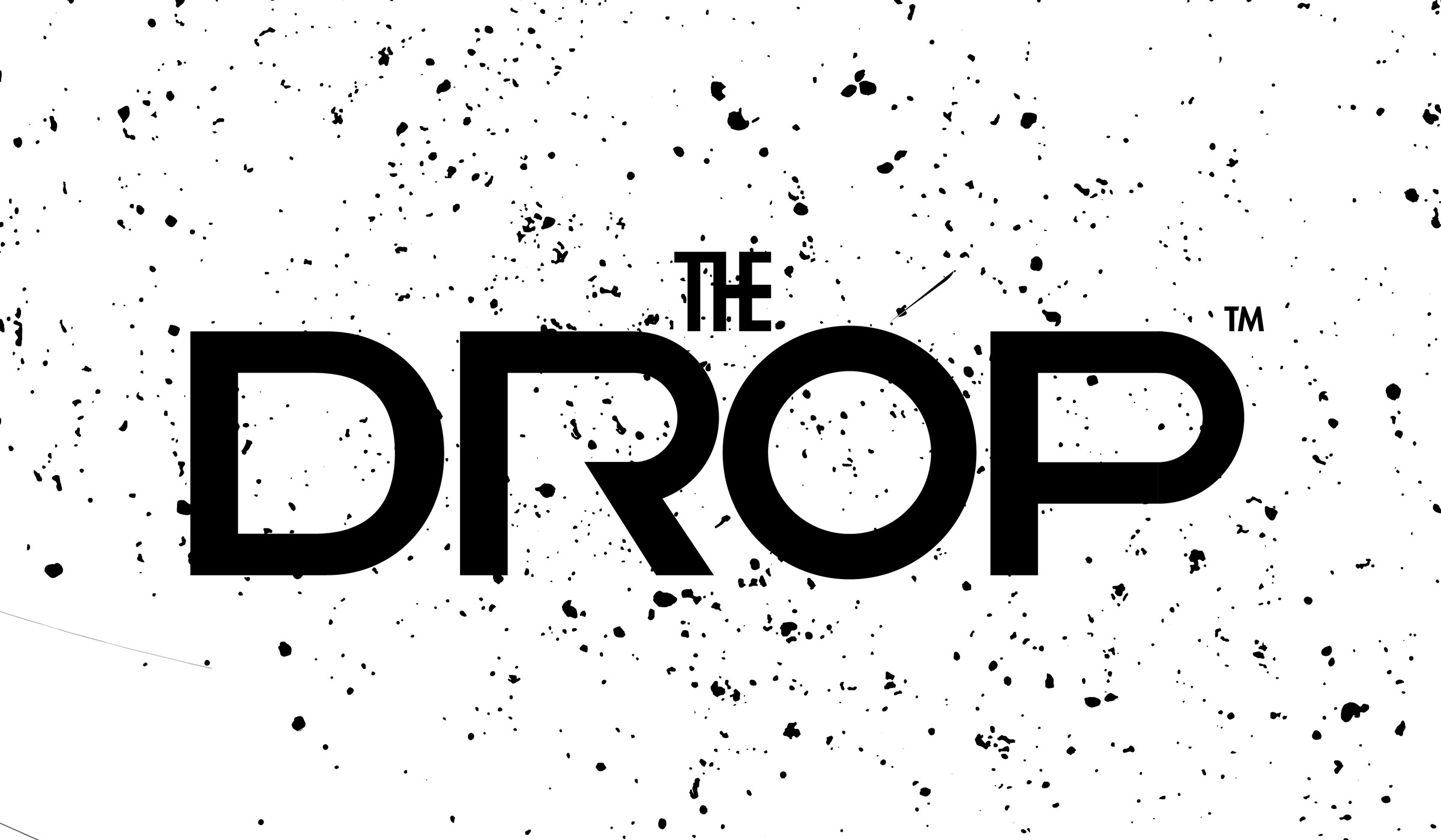
The work for The Drop Records pulses with rebellion from the very first frame. This identity isn’t polished or polite — it’s loud, disruptive, and loyal to the raw energy that defines a record label built to challenge the status quo. Every design element feels like a beat: urban, direct, unfiltered.
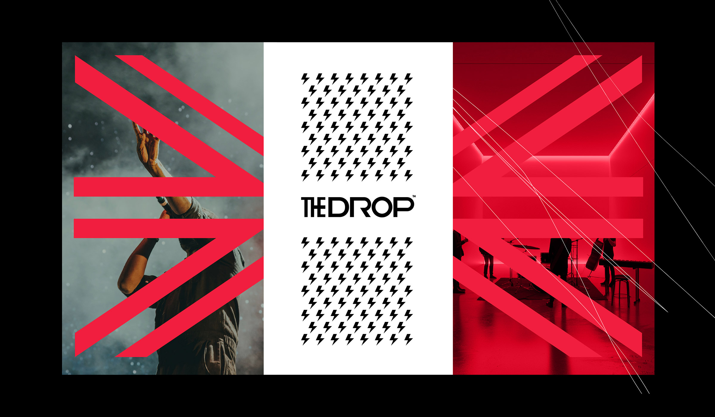
The graphic style relies on contrast — deep blacks, heavy typography, and compositions that embrace fragmentation. There’s no fear of space or noise; the visual narrative mimics basslines, cuts, and echoes. It’s an identity that is as heard as it is seen.
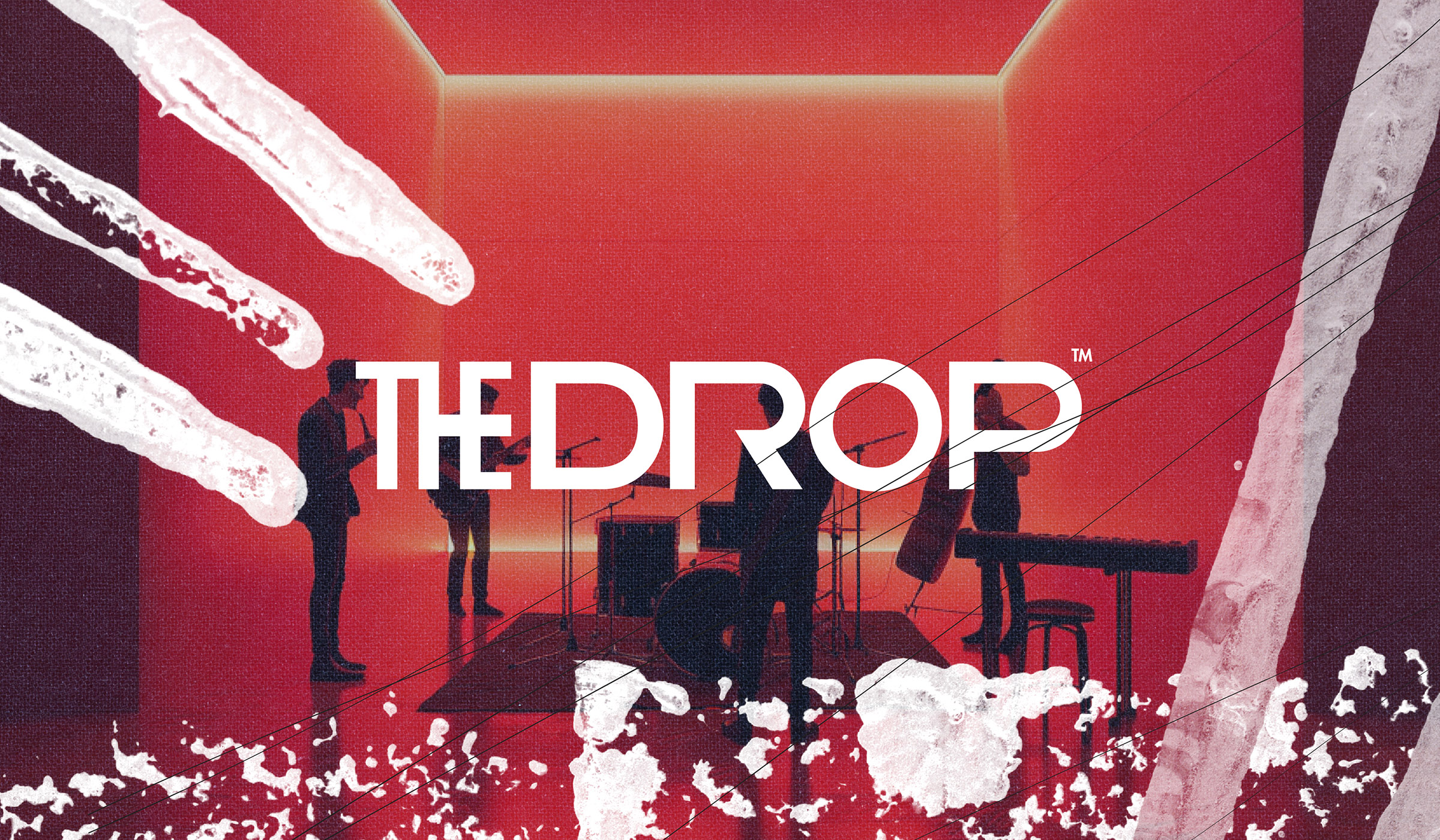
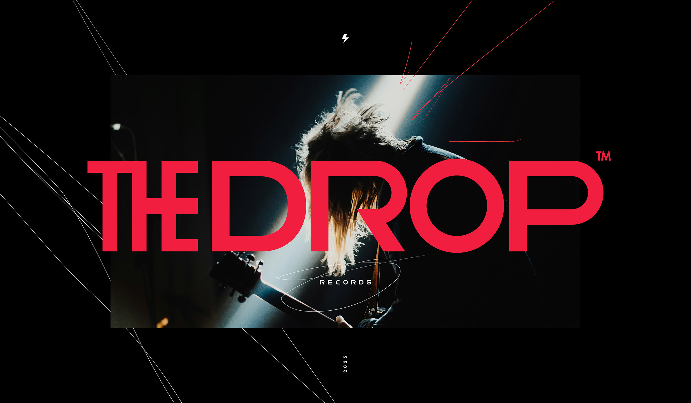
The editorial and digital approach maintains that tension: the online experience becomes a stage for visual collisions between institution and underground. Design here serves a cultural community more than a corporate brief.
This project is key to understanding how visual identity can become the engine of a scene. The Drop Records isn’t just a music brand — it’s a narrative space for artists who need a visual language with impact.